3 High-Fidelity Prototyping Principles Designers Need to Know
Discover 3 high-fidelity prototyping principles a UX Designer at Microsoft follows everyday.

We recently caught up with Darren Bennett, former UX Designer at Microsoft, to discuss all things high-fidelity prototyping. In this article, we’re going to delve into how he approaches high-fidelity prototyping—specifically, the three principles that he follows on a daily basis.
What is high-fidelity prototyping?
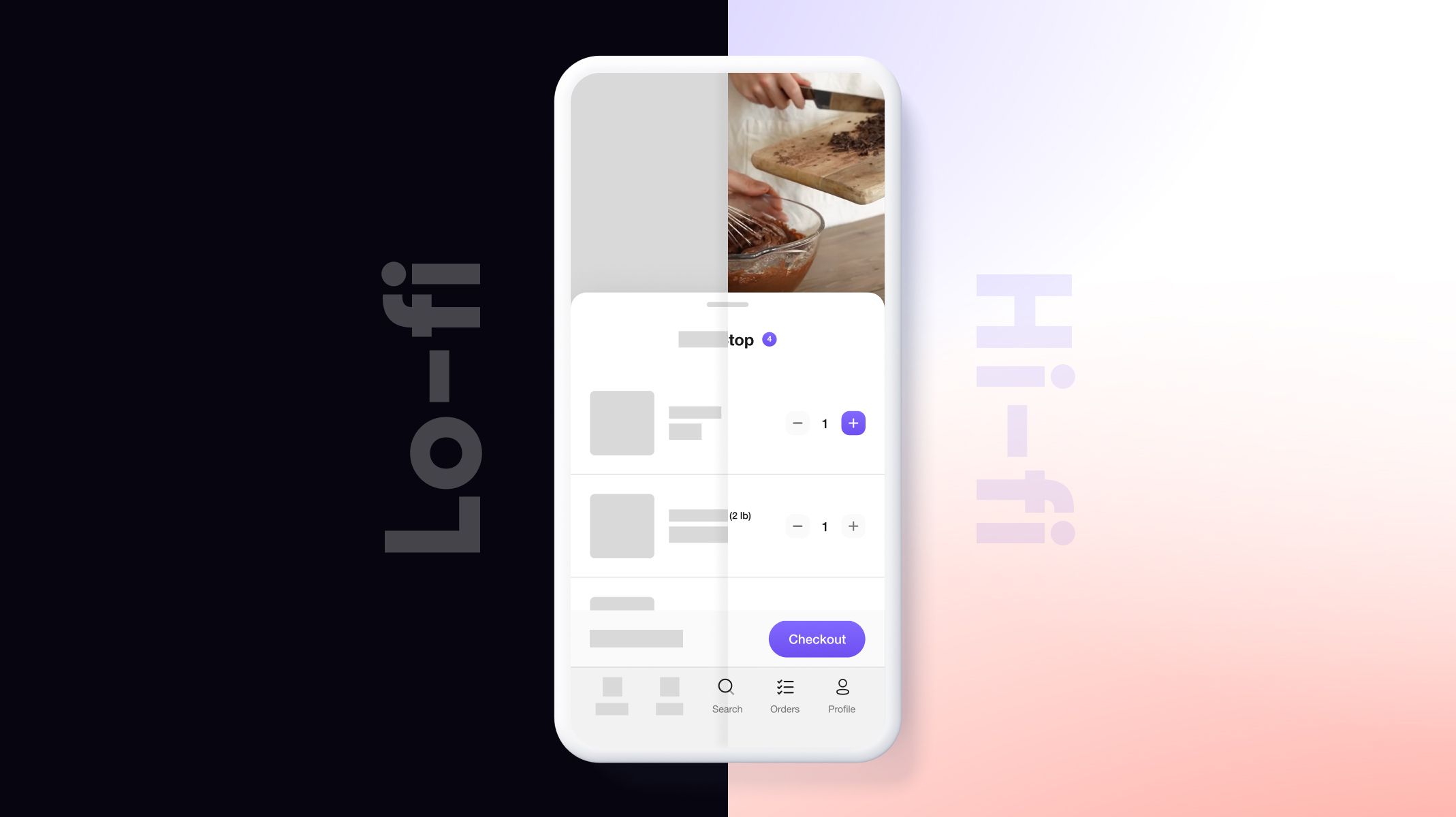
High-fidelity prototyping is the process of creating prototypes that look and feel realistic, are highly functional and interactive, and are barely distinguishable from the end product. You’d typically create high-fidelity prototypes with a prototyping tool like ProtoPie.
Use high-fidelity prototypes for the following:
- generate interaction design ideas
- communicate interaction design ideas
- validate interaction design ideas
- do user testing
- do usability testing
- get approval from stakeholders
The main advantage of high-fidelity prototyping is discovering mistakes or improvements before moving into costly development and implementation.
Over to you, Darren…
1. Remember: you’re not building a real product
High-fidelity prototyping tools (like ProtoPie) are so advanced that designers can almost get caught up in everything that they can do. It’s easy to lose yourself in a project and to feel like you’re creating an actual product.
The thing is, as soon as you're in that mindset, you start wanting to make everything work. You want to make it flexible, modular, and reusable—even though this is totally unnecessary. Prototypes aren’t the end product, they just help you to receive crucial feedback and iterate more effectively. I personally believe you should create prototypes as quickly as possible while still making sure they function and look the way that they should.
Try not to spend time perfecting the visual look. Just make them good enough to be believable. At the beginning of the design process, in most cases, your job is to create ten or so prototypes, test them all, and get rid of eight or nine of them before proceeding. If you’re spending multiple days just to produce a single component, your development timeline is going to take a lot more time than you planned.
2. Work on interaction design before UI design
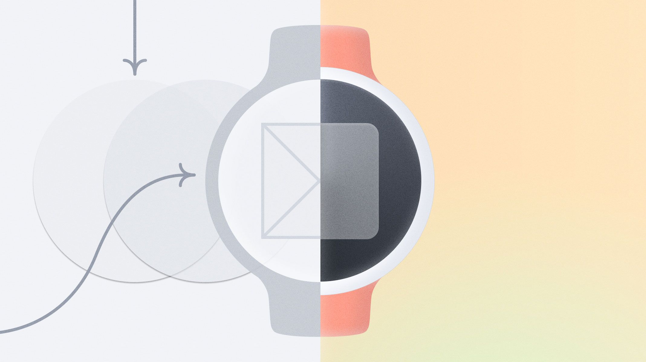
I always suggest that designers design first in a prototyping tool rather than in a static UI creation tool. Many designers are accustomed to using Sketch, Figma, Adobe XD, and so on—in other words, tools based focusing on UI design primarily rather than interaction design. The problem here is that it’s easy to miss key interactions and scenarios that need to be designed for.
Think about the gaming industry. They spend a a lot of time on white box testing, trying to work out how everything will interact from an interaction perspective before they layer on final graphics. Unfortunately, in the digital product design world, too many professionals do this the other way around. The main thing is to ensure that the product works as expected—the high-fidelity visual design can come later.
I’ve seen this mistake happen in quite a few different companies. Product and UI designers will immediately start creating a high-fidelity UI in Sketch (or whichever tool they’re using). Meanwhile, the UX practitioner will head off and conduct some user research to test fundamental ideas using basic wireframes. When it comes to the actual prototyping process, it becomes a struggle to fit the product’s functionality into the static UI that has already been created.
This is why interaction design is so important. Interaction designers need to stitch together the UX and UI, focusing primarily on how the product will work before layering in the visual design elements.
3. Don’t get too emotionally attached
I sometimes see designers, especially those at the beginning of their careers, becoming dejected when their prototype is torn apart (figuratively, not literally!) by test participants during the usability testing process. They’ve worked so hard on producing the initial prototype, creating beautiful animations—only to witness that users ignore them and that slick motion design doesn’t fix bad UX design.
This comes back to the previous point. If you focus too heavily on the UI design and neglect key usability factors, it doesn’t matter how nice it looks—the prototype won’t receive great feedback.
So it’s important for designers to not get too emotionally attached to any high-fidelity prototypes they create. Remember that it’s just a prototype! Its sole purpose is to help you gather the insights you need to make sure that your product itself is a success.
Prototyping is a key step in the product design journey, but it’s not the final destination. Create prototypes with the expectation that users will tell you just how bad they are. Welcome this “negative” feedback. After all, it takes you one step closer to creating a brilliant product.
Want to learn more from Darren?
Thanks for your great insights, Darren—we hope that you can apply his principles to your own prototyping. If you’d like to hear more about how Darren approaches high-fidelity prototyping, and to learn his key tips and tricks for getting the most out of ProtoPie, then check out the following:
New to ProtoPie?
Apply Darren's 3 key principles right away by creating your first high-fidelity prototypes with ProtoPie.
.jpg)