The Importance of Prototyping and Your Design Stack
Is prototyping really that important? Darren Bennett, UX Designer at Microsoft, answers this question and sheds light on building the right design stack for prototyping.

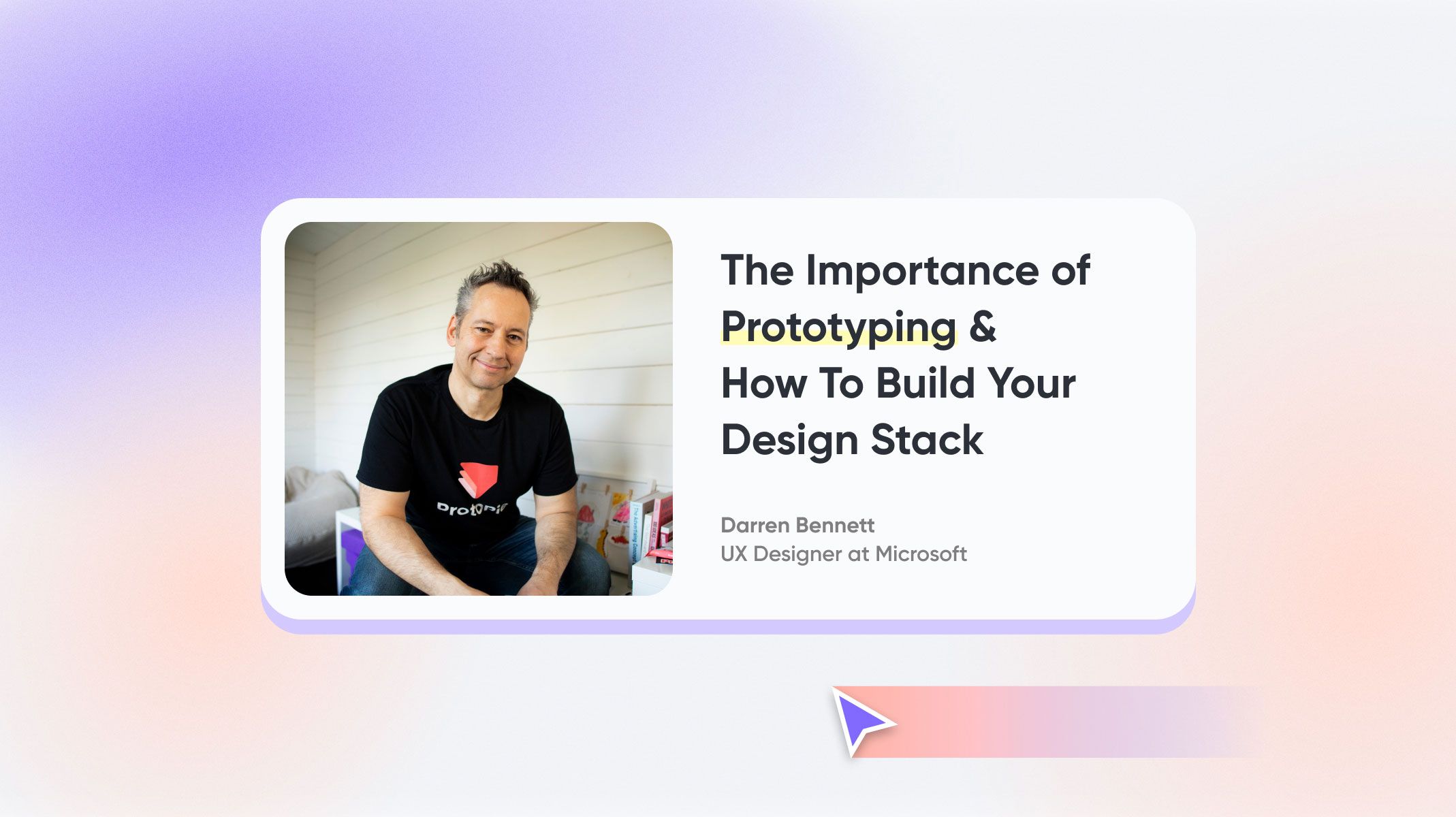
Here at ProtoPie, we’re proud that some of the design industry’s leading figures use (and love) our products. Figures like Darren Bennett, former UX Designer at Microsoft.
Darren has been a designer for about 32 years, starting out in graphic and brand design before the emergence—and widespread adoption—of the internet. He then forayed into Adobe Flash, creating Flash games and Apache Flex enterprise applications, until the iPhone came out in 2007 when his focus turned to mobile.
He worked in mobile for around 12 years before transitioning into multi-device design. Now, he’s currently working at Microsoft on the Windows & Devices team, collaborating with multiple teams of designers that design everything inside of Microsoft.
We caught up with Darren to discuss why prototyping is so important and how designers should approach building their very prototyping stack.
Why is prototyping so important?
Everyone, including designers, is inherently biased. We’re controlled by our brains—so we design according to how we think as individuals. But you can’t produce products for the masses if you only ever take your own perspective into account. That’s where testing comes in.
You need to test your designs on everybody: people of different ages, people from different cultures, people with disabilities, and so on. Once you start to see how all these different people use your design, you can begin to draw some insights about what needs to be improved or changed.
There will always be things that you thought might work but didn’t. Or, there might be some key elements that you've missed. That’s why it’s so important to test your designs with prototypes. Don’t assume that you know everything—a good designer is a humble designer.
It’s also worth mentioning that you can't just rely on static design tools—they’re just tools to create graphics. They’re ultimately better versions of Photoshop and as great as they are at drawing vectors, buttons, and so on, they’re not a replacement for proper interaction design. They don't have the capabilities to get you close enough to the real thing.
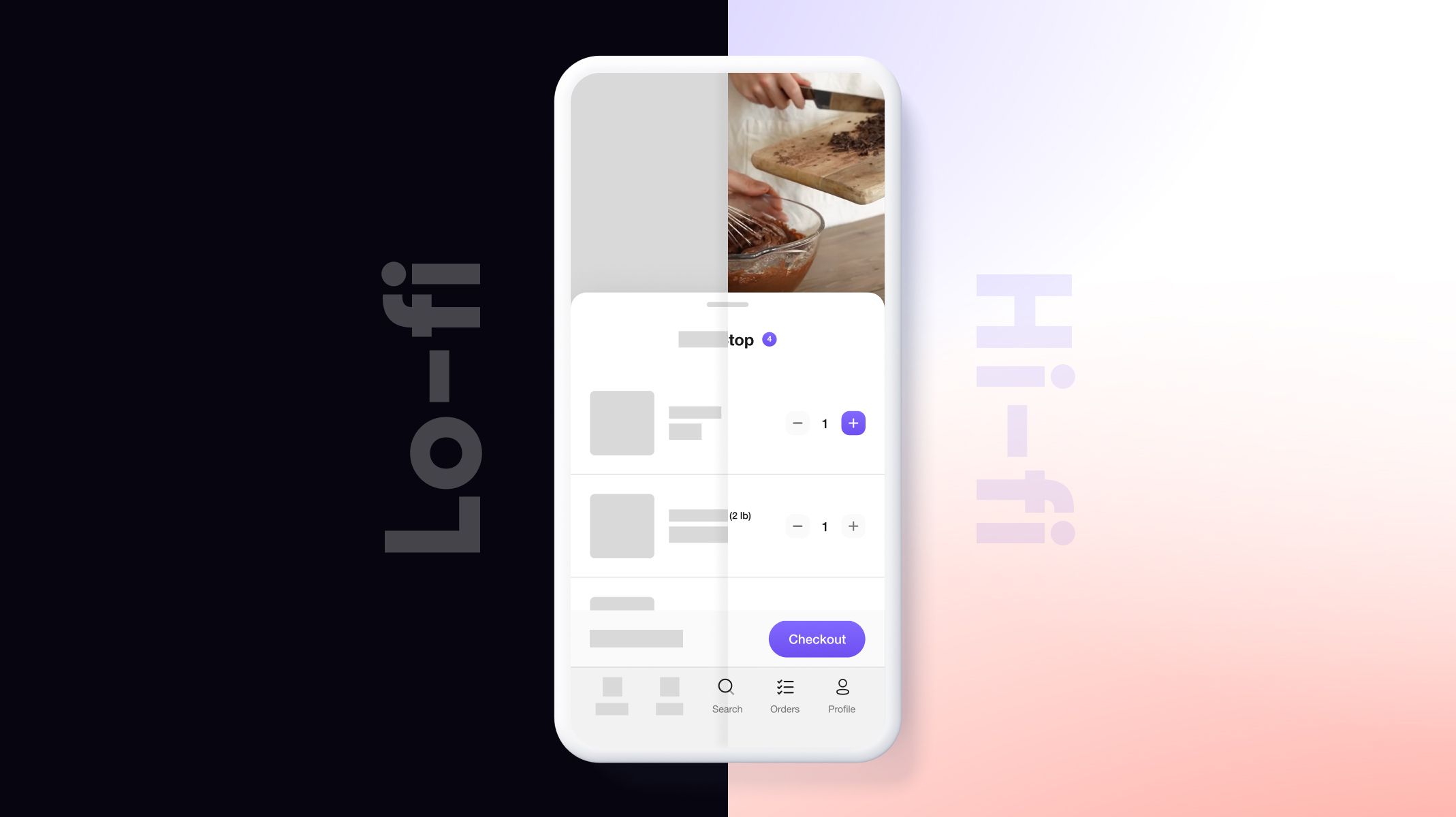
Some tools do have low-fidelity prototyping capabilities. While low-fidelity testing certainly has its benefits, you still always need to conduct high-fidelity testing too. If you jump ahead and go straight from wireframes to building a product, you're almost certain to miss critical design use cases—and it would be even more expensive (and time-consuming) to make the necessary adjustments later on.
With so many tools out there, do designers need to learn them all?
First and foremost, no—you definitely don't need to learn all the tools out there to do your job. I’m a bit geeky and love testing out new tools, but that’s because it’s my passion, not a necessity for my day job.
Ultimately, it all comes down to needs. Which tools do you need to do do the job right? It’s not a case of the more the merrier. If you’re constantly going from one tool to the next, not only are you costing your company a lot of money in license fees, without gaining enough expertise in any one tool to derive maximum value from using it.
I don’t think there’s ever going to be a one-tool-to-rule-them-all type of scenario. And even when there are tools that do a lot of great things, from my experience, this can actually be too overwhelming. I remember using Autodesk 3ds Max when I was trying to learn 3D—like most 3D tools, it actually had about 4 apps inside of it. There was one for 2D path creation, a lofting tool, a modeling tool, and a shading tool.
When I realized that this one app contained so many different elements that I needed to learn, it made me a feel bit overwhelmed. If they had been separate apps, I think I would’ve found it easier to take the process one step at a time.
How do you approach building out your design stack?
Designers need a complementary design stack that helps them with each element of the design process: producing wireframes, UI design, high-fidelity prototyping, and so on. The first step is to map out every single stage of your design process, the timeline from taking an idea and building a tangible product or feature. Then, you can begin to find the ideal tool for each stage.
If you introduce a tool but you find that it keeps on getting in your way (for whatever reason), then it’s probably not the right tool for you. The ideal scenario you’re looking for is to reduce as much friction as possible from the design process. The tools that you use should fit within your process, not the other way round. If you find this is the case, then look for an alternative. Want to find out more tips and tricks from Darren?
If you’re new to high-fidelity prototyping, or you just want to improve your own approach, then you should check out Darren’s great educational content. His training will teach you everything you need to know about how to use ProtoPie, all the way from the basics to whatever you need to becoming an advanced prototyping wizard.
Check out the following:
That’s right—you’ll be getting key insights, tips, and tricks from a former Microsoft UX Designer. What more could you ask for?
New to ProtoPie?
ProtoPie is the easiest interactive prototyping tool for all digital products. Designers can turn their UI/UX design ideas into high-fidelity prototypes for mobile, desktop, web, all the way to IoT. They can explore, validate, and test design solutions and ideas by creating very realistic, production-like prototypes without code and the help of engineers.
.jpg)
