ProtoPie’s Interaction Libraries in a Nutshell
With ProtoPie 5.0 comes interaction libraries. You could build interaction components already, but now you can turn it into a full-blown interaction design system to share with your team.

Libraries have been a long-requested feature and it's great they are finally here. So let's explore how ProtoPie has addressed the sharing and management of reusable interactions and how it might change the way you handle prototyping in your organization.
An overview of interaction libraries
Interaction libraries in ProtoPie should be instantly familiar to you as they share some traits with other tools such as Figma and Sketch. That said the big difference here is that these components are interactive. This effectively allows you to build a fully working design system that your design teams can use; similar to how real code design libraries are used and managed.
There are some differences, however. For example, library files can't be saved locally like a regular Pie file. Instead, they are synced from ProtoPie Cloud to ProtoPie Studio. Publishing changes to Cloud make interaction libraries accessible to you or other team members to use.
It's worth mentioning at this point that the features of interaction libraries differ depending on whether you have a Free or Pro plan. With a Free plan, you can create personal libraries for use within your own prototypes but because a library file isn’t physically saveable to your computer you can’t share the library with other designers. For the ability to share a library you need to have a Pro plan.
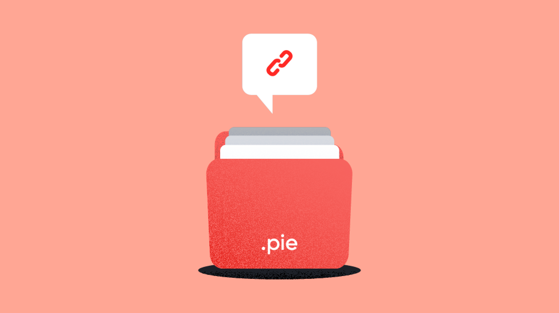
There is a workaround to this which is to create a library of components as a regular Pie file as ProtoPie 5.0 has an Export as New Library feature. With this method, you don’t get the connectivity of updates but it does still allow you to use your libraries outside of teams. For any freelance designer, I can see this as a definite need.
Using interaction libraries
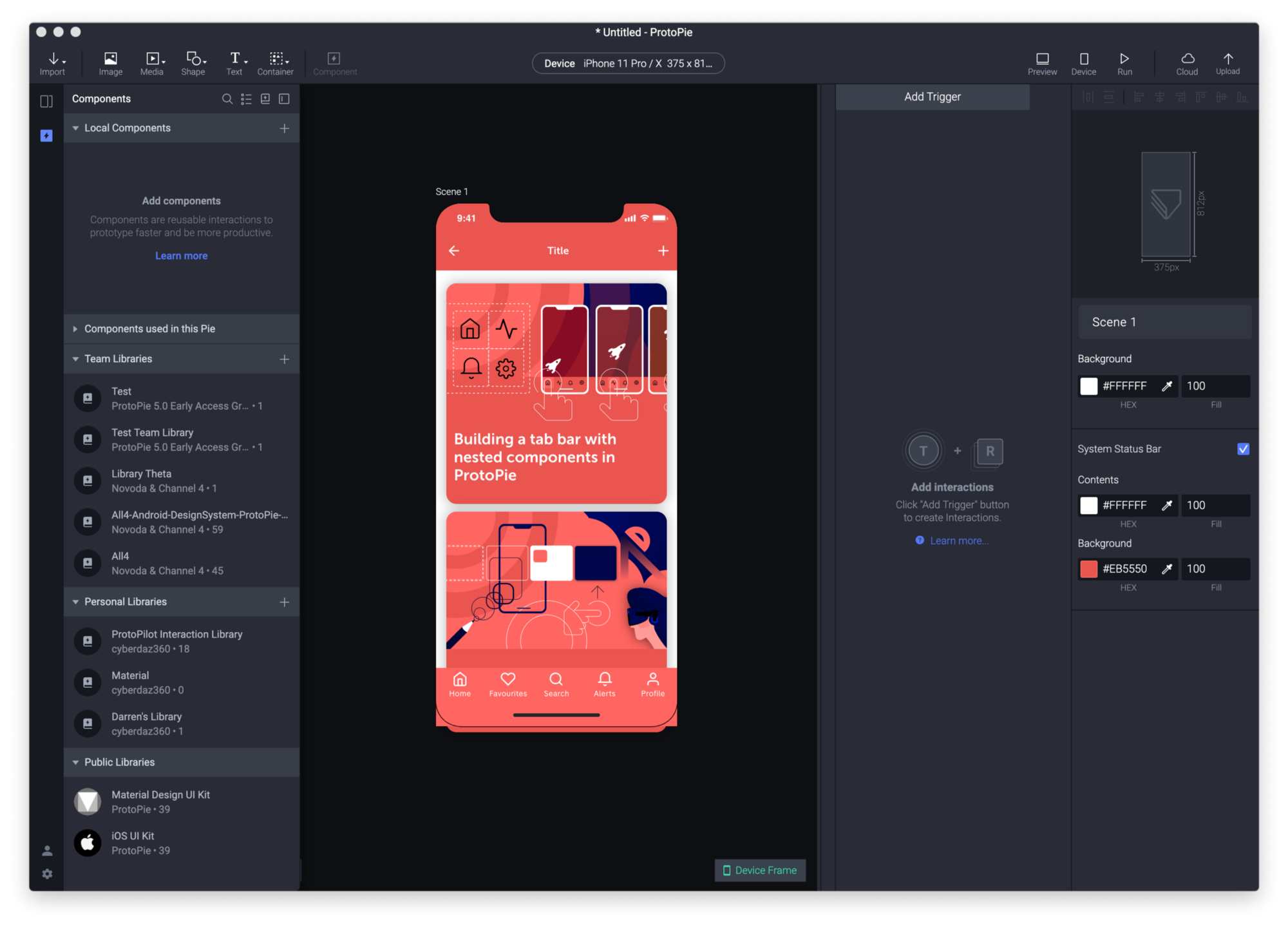
All interaction libraries associated with your team account can be accessed from a revamped component panel. In the component panel you have the following features:
- Local Components
- Components used in this Pie
- Team Libraries
- Personal Libraries
- Public Libraries
Local Components
You can think of this as the current version of the components panel in version 4. Any components saved here are only accessible to the Pie you create them in.
Components used in the Pie
When you drag out a component into a scene it will be added to this section. You can use this as a quick way to find and add components you have already used in your pie to add more instances. You can also navigate to the instances of a component by ctrl/right-clicking a component and choosing Go to Instance. You can also Add to Current Scene.
Team Libraries
Here you will see all the team libraries listed. Tap a library to navigate to it. You will notice a back button that will take you back to the main component list. You can also create new team libraries but tapping the +.
Personal Libraries
These libraries are connected to your Individual plan; or if you are in a team, your personal space. Only you have access to these libraries.
Public Libraries
These libraries are built and supplied by ProtoPie themselves and consist of a library for the Material Design UI Kit and the iOS UI Kit. These libraries differ from interaction libraries you create because they are locked. This means you can’t gain access to their inner workings but you can freely use them in your own projects. Like all components, they make use of Send and Receive to pass messages so you can use them to trigger responses and make interactive UI. To read more about Send and Receive see my previous article ProtoPie components 101.
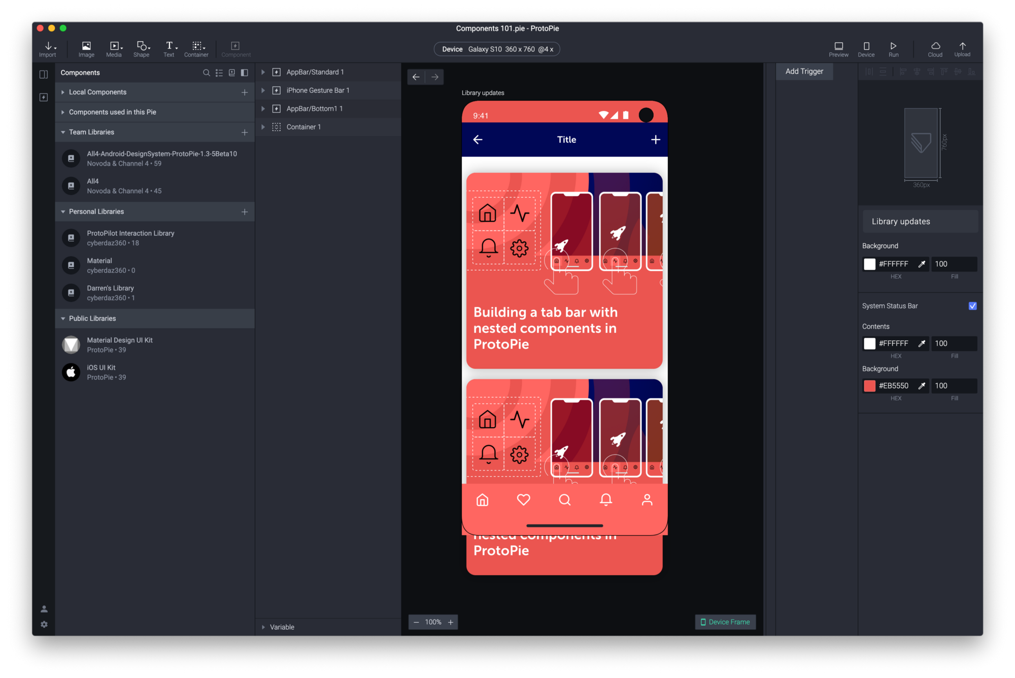
You can organize components into groups by using the forward-slashes e.g Buttons/My Button.
Each group is collapsable toggling the disclosure triangle. You can also view interaction libraries as a grid of thumbnails or as a list. If you have long names then the list view is useful as names aren’t truncated like they are when you are in Grid view.
You can also search for items by name across all of your interaction libraries. I emphasize search, there is no filtering so when you navigate into a library and enter a search term you are actually going to receive results from all libraries. This might at first be confusing so just so you know, that's how it currently works.
Library updates
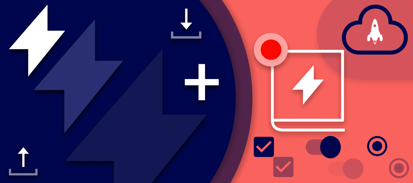
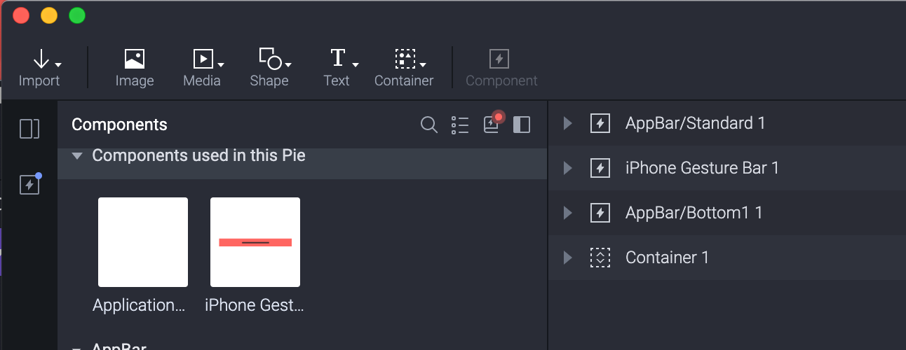
Within the component panel nestled between the list/grid view toggle and the pin panel button sits the library update button denoted by a book icon with a lightning bolt inside. You can tap this icon to open the updates panel at any time but when an update has been published a discreet flashing dot will appear on this icon to let you know there are updates.
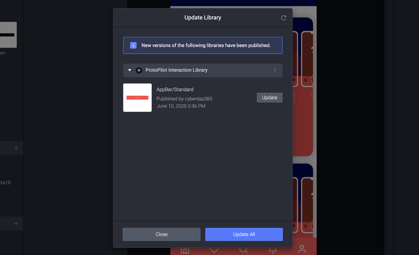
Open this panel up and you’ll find each updated component listed. You will only receive updates for changed components that you have actually used in your prototype. Any other components are updated automatically. At the moment you don’t have any way of knowing what has changed through this panel. There are no side by sides or version control comments. If you have library access you can open the interaction library to view the component or you could go into Cloud to check the version notes, maybe in a future update, we’ll have access to notes which I think would be incredibly useful. You can update all components or choose ones to update individually.
Library owners and members
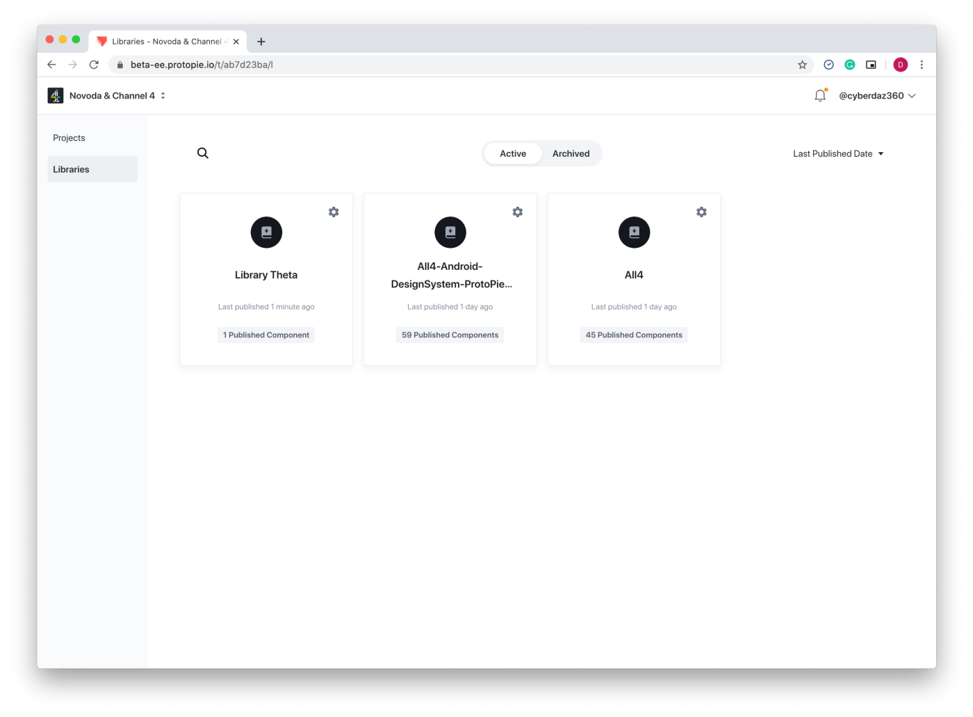
In the cloud, ProtoPie’s interaction libraries have their own space, separate to projects. All members of a team can use all libraries created within a team space. You add team members to team libraries to give them edit rights. If a team member isn't added to the list they can still use interaction libraries from ProtoPie Studio’s component panel.
Components in the properties panel
If you select a component you will notice that there have been some additions to the properties panel. In addition to the ability to Go to Master Component you now have the ability to swap components.
Tapping the component dropdown gives you access to all components in all libraries as well as components already used in the current Pie. There is a search function to help you find what you need or you can navigate through the nested pop-ups. A Related Component section shows components from the same group such as buttons.
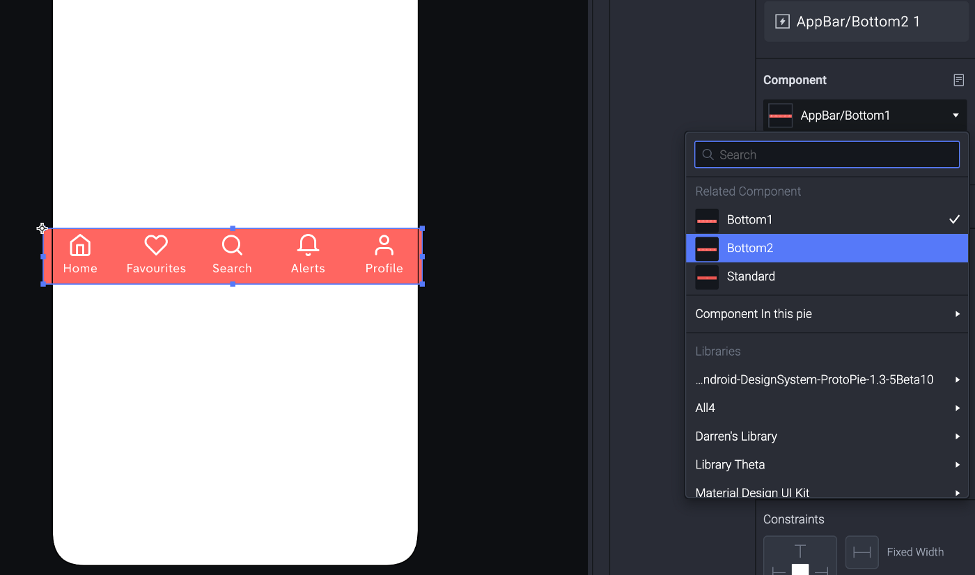
When you swap components they aren’t constrained by size like they are in Sketch for example. This means that any component can be swapped with any other component. If they are the same size they will swap perfectly but if they aren’t they will change to the swapped components size.
Component guide
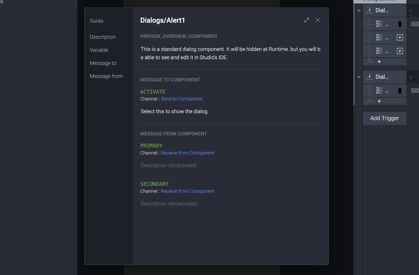
It’s clear that the libraries' feature is ushering in a design system mentality. To enable users of these libraries to understand how the components work and what their features are the component guide has been added. This guide gives the component creators the ability to document how their components work. The following properties can be documented:
- Description
- Variables
- Message In
- Message Out
Send and Receive
You use Send and Receive together to extend the functionality of your components. You can send messages out of a component and use the Receive trigger to intercept them, adding whatever responses you wish. For example, you could create a switch component and send a message out when the switch is on.
The reverse is also true; send a message into a component and with Receive trigger internal interactions, for example, set a tab bar item as active inside a component. To find out more information on Send and Receive refer to my article ProtoPie components 101.
Overriding variables
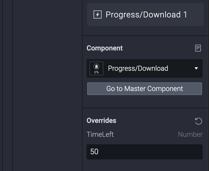
In addition, to Send and Receive and new to ProtoPie 5.0 comes the ability to make variables internal to a component overridable. You can access variable overrides in ProtoPies’ properties panel. This is a very powerful feature that allows you to do things such as setting values for a component that are calculated and used internally. In the example below, I’ve created a download indicator component and with this simple variable override, I can control the download indicator speed.
Converting existing components
If you’re already into components you may already (like me) have a Pie file with a set of components. If so then good news, there is an Export as New Library feature under the File Menu. Run this command with your Pie open and a new library file will be created and opened. To make it accessible to your team publish it as you would any other library.
Final Thoughts
So there you have it. It’s a game-changing feature that now makes it incredibly easy to manage your app’s design system. More and more we are seeing design tools gravitate towards greater collaborative features and certainly, for interaction design tools, the ‘throw-away’ prototype can now be superseded by a fully functional interaction design toolkit.
If you are working with established products delivering against an incremental roadmap then interaction libraries have made ProtoPie a ‘must-have’ tool in your product design arsenal.
For videos on how to use ProtoPie check out my YouTube Channel ProtoPilot.
