Prototyping for the Pixel watch
Prototyping for smartwatches is once again being pushed to the forefront of UX design with the launch of google's new Pixel Watch.

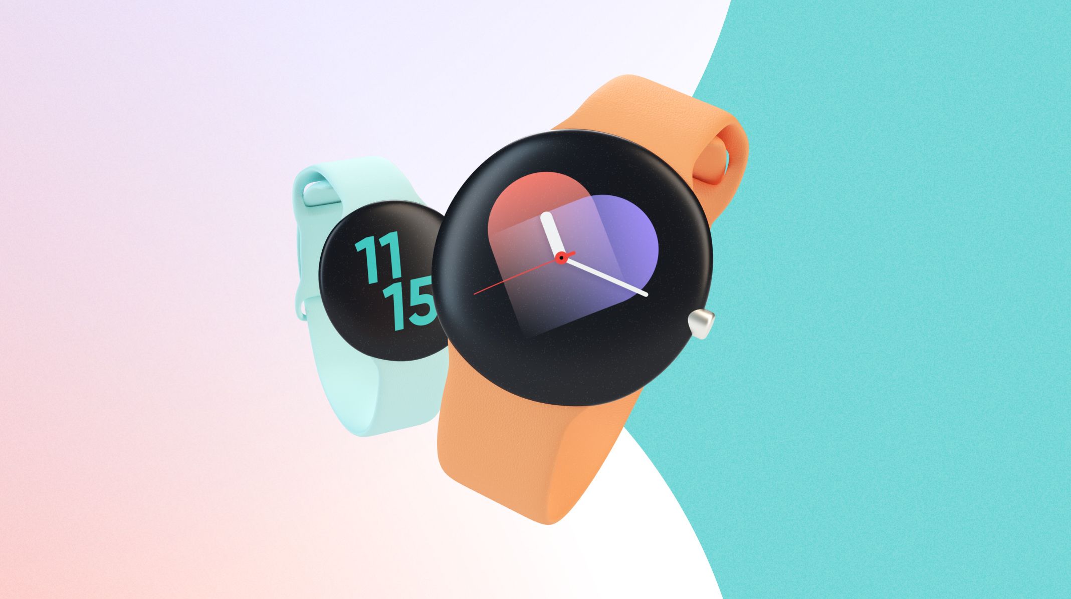
Smartwatch UX design has been steadily gaining importance in recent years. As Apple's WatchOS devices such as the recent Apple Watch 8 have exploded in popularity, so has the need for powerful wearable apps. Prototyping plays a huge part in smartwatch UX design. It can arguably be more important for newer devices that require more care throughout the design process.
Let's take a deep dive into prototyping for the Pixel Watch, and any other WearOS device, and find out how to successfully create smartwatch prototypes.
What makes prototyping for smartwatches different?
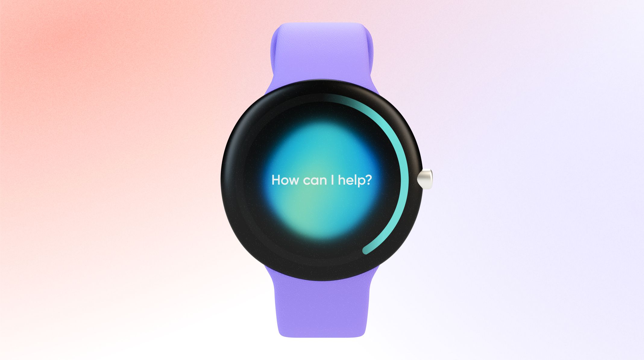
Smartwatch UX design as a whole is quite different from web app or smartphone-oriented processes. There are a number of restrictions to take into account when working on a smartwatch interface and UX interactions. These restrictions do not only limit your potential smartwatch UX designs on the wearable device. In fact, they also open up new opportunities for smart UX designers to get creative:
- Smartwatches have less than a third of the screen size of a smartphone
- These wearable devices are powered by smaller chips providing less power for intricate UX designs
- Wearable device users are generally looking for extended battery life
- Smartwatch UX doesn't stop with the watch, it extends onto the paired smartphone app
How do smartwatch UX design restrictions impact prototyping for the Pixel Watch?
The Pixel Watch is a new WearOS device and is submitted to the same restrictions, even if it is the only WearOS device made by Google themselves. This nuance may give them a slight advantage when it comes to Google's own apps and their performance, but that's about it.
Prototyping for smartwatches is a crucial part of the UX design process. In fact, Google uses third-party prototyping tools to make sure their smartphone and smartwatch applications work as intended. The Pixel Watch has remained shrouded in secrecy since its announcement in May of 2022. All the more reason to have some solid smartwatch UX design processes in place for your new apps.
What we do know is that the device will have a small, rounded screen, and will be powered by Google's WearOS. How well it performs compared to other leading WearOS devices such as Samsung's range of smartwatches remains to be seen. As does how your smartwatch UI designs will fit in the rounded screen.
You can read more about how Google uses ProtoPie for their prototyping needs here.
Your smartwatch UX is not stand-alone
There is a smart way to get around smartwatch UX design restrictions, especially the small screen size and limited power potential. In fact, this is the only realistic way to build smartwatch UX designs that will not leave your users dissatisfied with the performance or the smartwatch UI.
Starting your design process with the mindset that your smartwatch and your smartphone are not two distinct screens, but a pair that work in tandem is a game changer. This allows you to not only optimize the user experience but to provide a sense of satisfaction that comes from having two devices work seamlessly together.
The Pixel Watch is no exception. In fact, you will not be able to get the most out of a Pixel Watch without pairing it with a smartphone. Google has decided that this device will carry the same limitation as the Apple Watch 8: you will only be able to pair it with an Android device (against an iOS device for the Apple Watch).
Smartwatch prototypes need to be tested across devices
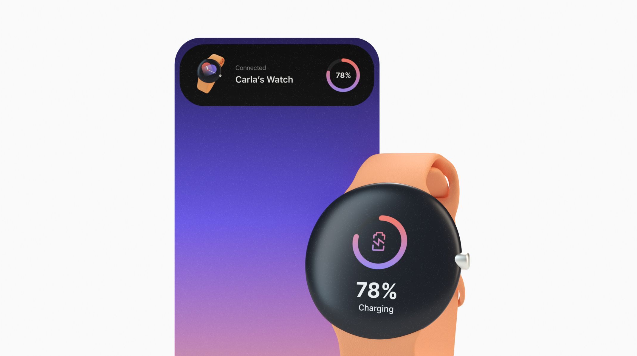
By treating the smartwatch and smartphones as a pair, cross-device testing becomes a necessity. The interactions between devices need to be fluid and logical, as they are most often initiated from the smaller device.
Whether prototyping the Pixel Watch, or any other Android smartwatch, you’ll need to specifically test at least the following:
- Navigation between screens including cross-device navigation
- Your smartwatch UX design meets specific use cases
- How the smartwatch UI fits on the specific screen format
- The delivery of essential information
- Responsiveness and performance - especially when using media and animations
Some of these prototyping elements may seem obvious, but when working within the restrictions of smartwatch UX design, the tiniest of tweaks can make a huge difference.
Focus on the core functionality of your smartwatch UX
Before even talking about Pixel Watch prototyping, you need to make sure your Pixel Watch UX design process is adapted. You can read more about Smartwatch UX in our ultimate guide. In the meantime, we need to talk about core functionality.
When building your UX designs for smartwatches you need to design with purpose. Smaller screens, less power under the hood, and a need to preserve battery life are a handful of the reasons why smartwatch UX design is crucial. Go back to your initial ideation phase and ask yourself why. Why did you decide to explore creating this product? If you haven’t already, run some early-stage usability tests on early prototypes and see if your ideas match the users’ intuition.
Realistic prototyping for the Pixel Watch - test and iterate from day one
Does the idea of running early usability tests send shivers down your spine? If you’re trying to DIY your testing, then the idea of extra workload alongside your UX design is definitely a scary thought. You can change things up for your Pixel Watch processes, benefit from realistic prototyping, and never look back.
What is realistic prototyping? Simply put, you take all of the benefits of high-fidelity prototyping and execute them in a rapid prototyping environment. How? Magic. Well, software magic, and some great UX design workflow changes. ProtoPie allows you to build new UX design processes that drastically change your output. Instead of working in low-fidelity, and then moving onto high-fidelity prototyping, you’ll be empowered to build your dream UX designs early on.
By building realistic prototypes for your Pixel Watch, you can test sooner and with better prototypes. Your testers will provide real feedback, as they can test your smartwatch UX designs on the wearable devices themselves. In fact, you can set up usability testing through ProtoPie, and provide users with a Pixel Watch and a paired smartphone. They will get the full intended experience from your smartwatch UX designs, and you will get the feedback you need to identify the core functionality to focus on.
Watch out for information overload when building your Pixel Watch UX
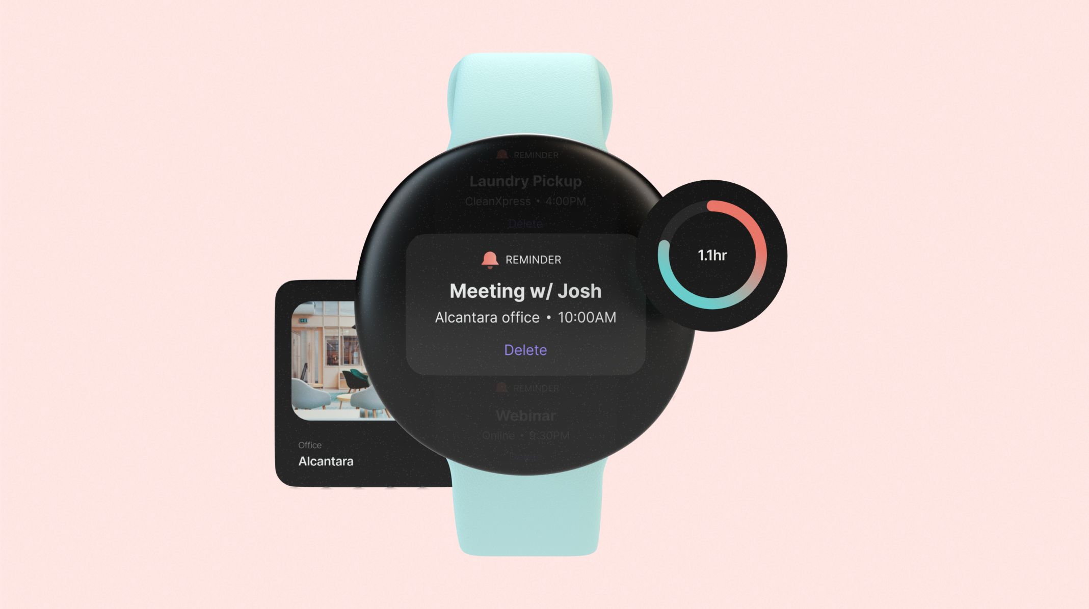
You’ve identified your core functionality and are testing and iterating regularly. You understand what your target audience wants out of your product, and have established the core functionality you must build. How do you make this work within the restrictive environment of a smartwatch UI?
This is where being smart with information and how you present it within your Pixel Watch UI designs comes into play.
The great thing about ProtoPie is that you can test these designs on a real Pixel Watch, and not a simulation. Not only does this mean you get a real sense of size and scale, but you can also accurately judge the impacts on performance that your Pixel Watch UX design changes cause.
Displaying information is the most crucial part of your future Pixel Watch UX flows. Most popular WearOS apps either display or record data in a convenient way. This data then needs to be made readily available for the user, either on the smartwatch’s UI or on the paired smartphone app. Delivering great apps for your Pixel Watch users means:
- Being able to choose which information is crucial
- Displaying crucial information without distractions
- Being able to put convenience ahead of everything else (sometimes)
- Making the right decisions for your Pixel Watch UI designs
How can you test the information display when prototyping for the Pixel Watch?
Depending on the app that you are building for your Pixel Watch, your test parameters will vary. But there are always some best practices to abide by when building smartwatch UX designs, which should translate into your Pixel Watch prototypes:
1. Evaluate if your smartwatch app is glanceable
We talk about interaction cost in more detail in our Ultimate Guide to Smartwatch UX. If your Pixel Watch prototype is glanceable then, for the core information, you’ve managed to keep your interaction cost low. When seeking information on our wrist, we do not want to twist and turn or spend forever waiting for the right information to appear.
Make sure your Pixel Watch prototype displays core information that takes a few seconds to process. For any further information that can be judged as superfluous, do not display it on the Pixel Watch UI. Save it for the paired smartphone app, or keep it on a second screen that you can scroll to on the watch.
2. How many interaction layers does your Pixel Watch UI have?
When building a smartwatch app you want to be efficient and convenient. This also means keeping the number of layers low. Create a single purpose for each screen, and use scrolling or swiping to add extra information.
When prototyping your Pixel Watch app, run usability tests that specifically target these interactions and see just how well your Pixel Watch UX does. If you find your testers swiping for their lives in a bid to find some core information, your UX design may need more tweaking.
3. Use notifications to deliver time-sensitive information without being too intrusive
Whether informing you of a payment you just made with your Pixel Watch, or letting you know you’ve managed to run 3 miles in a record time, notifications should always have a purpose. They are a great way to deliver core information in a timely way, and an amazing resource when building your smartwatch UX flows to gamify things.
A well-timed notification will provoke a bit of a dopamine high, and have your users keen to repeat the process. There is also a great sense of satisfaction that comes with receiving expected notifications, such as a payment alert (especially when receiving a payment). When setting up your usability tests make sure to include notifications as part of the experience. You can ask:
- If the notifications were too often or not often enough
- How intrusive they felt
- If the notifications were easily dismissed
- If they felt any personal information was displayed
- If the haptics accompanying the notification were useful or an unnecessary distraction
Pixel Watch Prototyping with the right UX Design tools
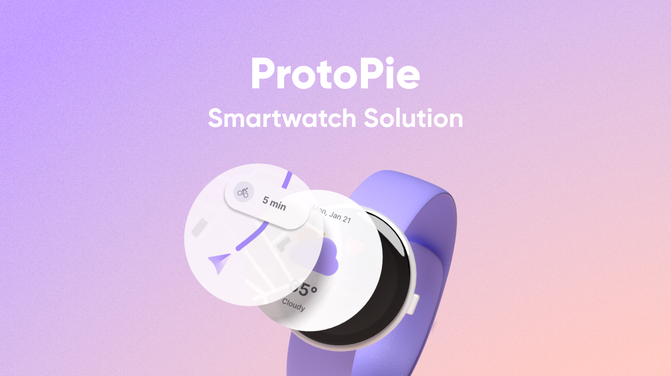
UX designers and creatives who want to design amazing products deserve the best tools. At ProtoPie, we’ve built a solution that takes prototyping your designs to the next level. This includes Pixel Watch prototyping which you can take to the next level using ProtoPie for wearables and smartwatches.
Are you ready to tackle Pixel Watch prototyping?
