How Fetch Uses Prototyping to Innovate
Learn how Fetch leverages ProtoPie to design cutting-edge consumer experiences.

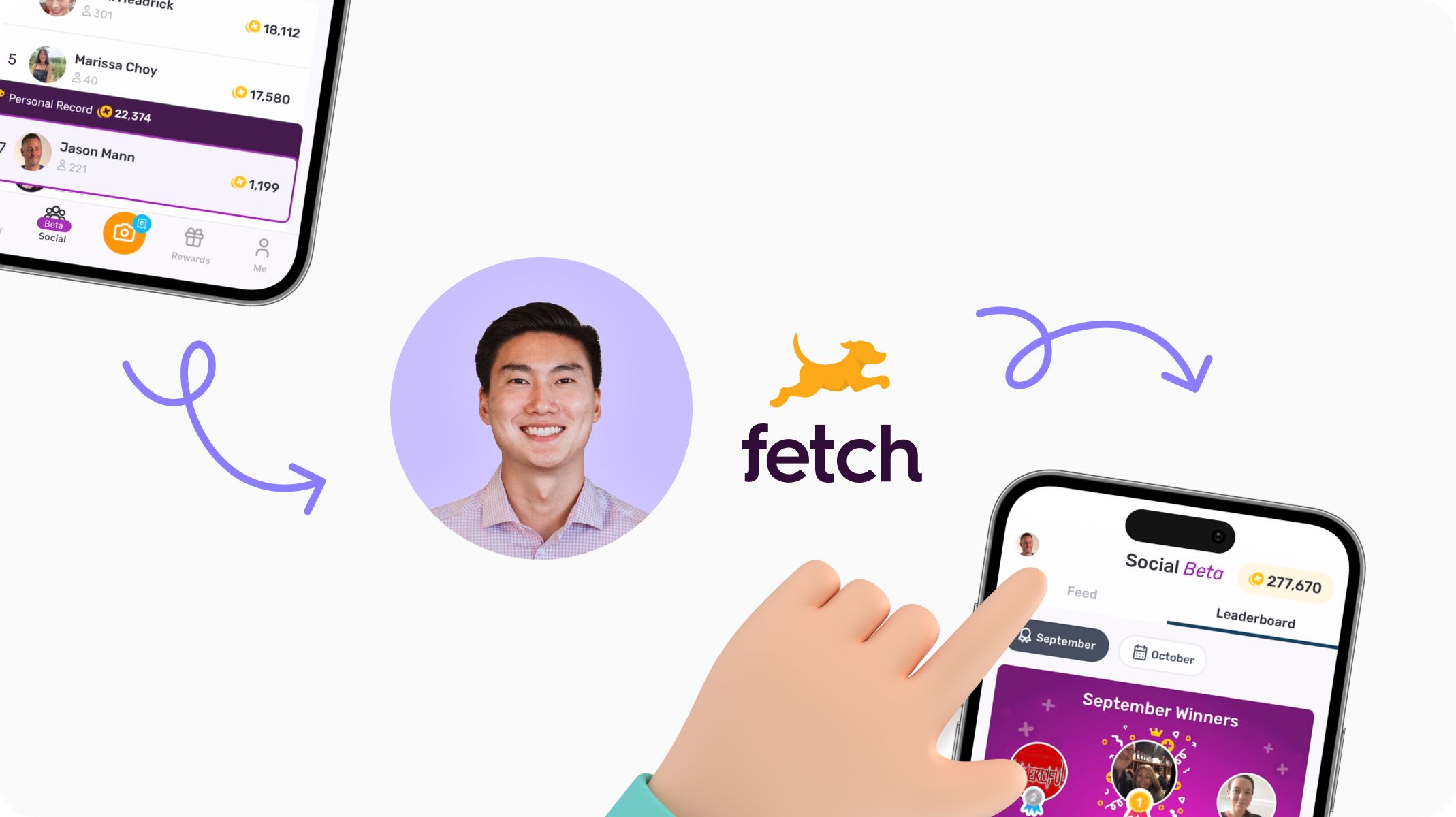
Earn points to redeem gift cards and rewards as you go about your usual day-to-day shopping. All you have to do is “snap” a picture of your receipt after the purchase. It may sound too good to be true, but it’s all made possible with Fetch—a consumer app that offers fast, fun, and hassle-free reward experiences for more than 17 million active users.
But behind this seemingly simple user experience lies a complex product design process. If you want to design innovation in a way that feels intuitive to users, you need to prototype early and often—and at a high level of fidelity. That's where ProtoPie, a high-fidelity prototyping tool, comes into play.
In our latest webinar, we heard from Taiki Ishii, Senior Product Designer at Fetch, on how his team uses prototyping (and, of course, ProtoPie) to enhance their design-driven innovation process. Watch Taiki’s interactive walkthrough below, or read on for a breakdown of his main points.
How the design team at Fetch approaches innovation
At Fetch, the design team approaches design innovation with a defined set of pillars—generating unestablished ideas that are humanly desirable, usable, and efficiently simple.
Innovation is different from traditional processes because it requires a higher level of fidelity and communication to ensure everyone is aligned. Of course, while innovation is important, it's equally crucial to focus on having a well-rounded approach to product development.
That means two things—you need to understand the nuances of each type of project and adapt the process accordingly.
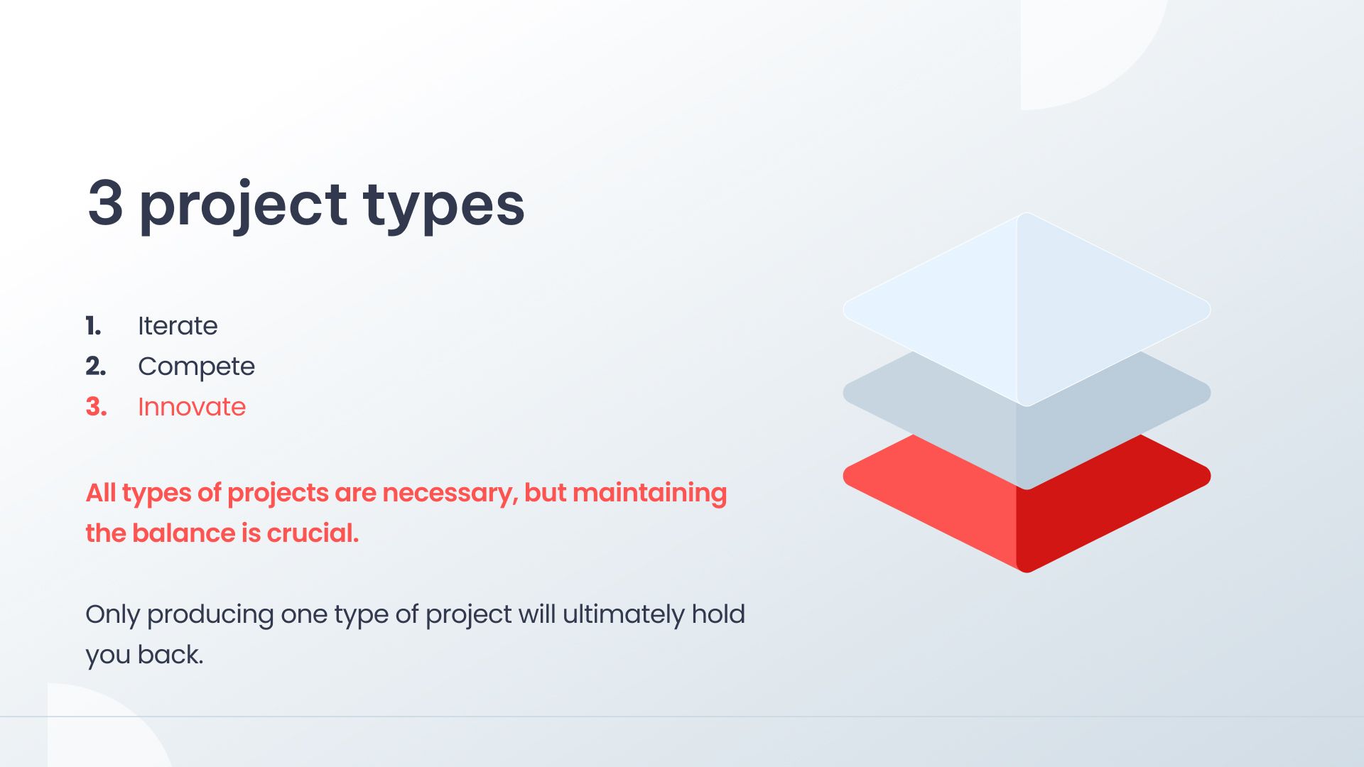
According to Taiki, the key to success is to maintain a balance between these three types of projects:
- Iterate: Making minor improvements to existing products or features to improve UI or get rid of user pain points.
- Compete: Making changes to what competitors have already done, with an existing proof of concept and adaption by users.
- Innovate: The most challenging type of project where nothing is guaranteed, and there is a higher level of risk because users may not fully understand or adapt to innovation.
When you recognize that you are part of an innovate-type project, the product design process changes in very noticeable ways—one of them being the role of prototyping.
Why you should prototype early and often
“One of the biggest things that I've noticed in my process changing is how early and often I get into prototyping,” says Taiki. “[That’s because it] requires an intense and high level of fidelity to communicate your designs and tell why you are doing what you’re doing.”
Taiki tells us that when designing for innovation, “prototyping as early as possible and creating prototypes becomes a massive leverage point for you and your team to be able to get behind you and create this product together from the ground up.”
He says that there are three key benefits to prototyping early and often for design innovation projects.
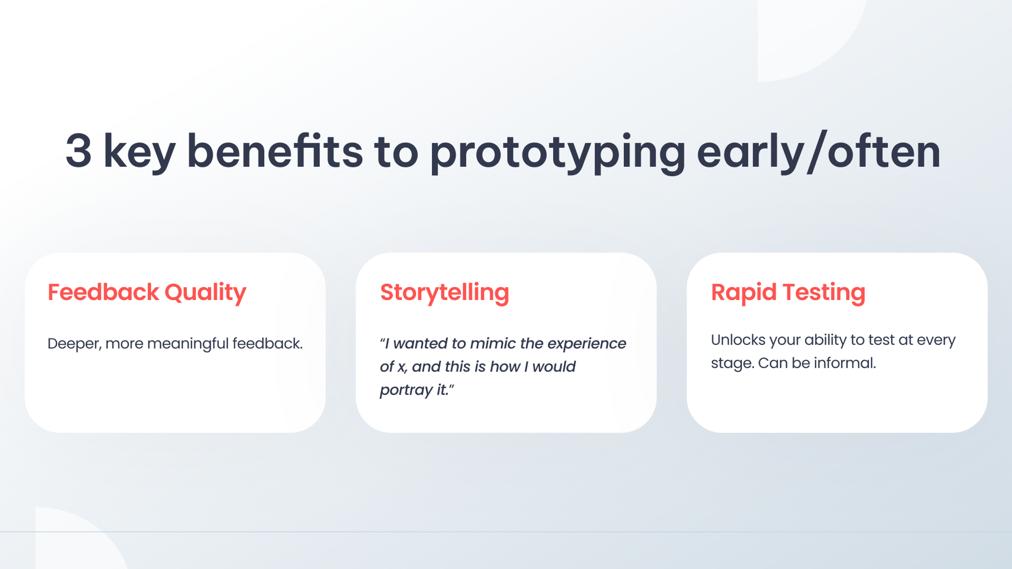
1. You get better quality feedback from stakeholders.
“Every single time you [create a prototype], show it to someone and get feedback, that feedback becomes more meaningful,” says Taiki. “As a designer, that is the bread and butter, that is what you want.”
In other words, the more you prototype, the more you can get actionable feedback to iterate off previous versions.
2. You can use “show, don’t tell” for better storytelling.
When it comes to describing or comparing abstract elements of a product, prototyping allows you to mimic the experience to tell a better story. There’s a world of difference between describing and actually showing a concept to someone, especially when the other person may not have had the same experience in their day-to-day life.
“Portraying [a concept] on a screen is something that you could use as leverage, and is very valuable in the entire process of innovating something,” says Taiki.
3. Early prototyping allows for rapid testing.
“Rapid testing is just the ability to test at even an informal level if your prototype is working to see if the user understands what you want them to do next or not,” says Taiki.
He adds, “Just being able to ask anyone that comes by about the prototypes because you have one so early on is a blessing and something that is extremely beneficial here.”
Nonetheless, with any decision comes drawbacks.
Best practices for prototyping
While prototyping, Taiki tells us that there are things he has learned the hard way and spent countless hours trying to fix and adjust—and here are the lessons he learned from it.
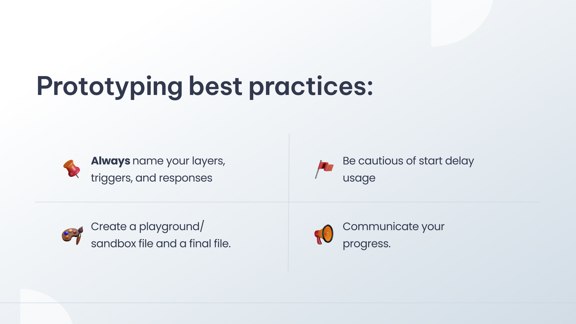
1. Always name your layers, triggers, and responses
Designers would have already heard this before, but to reiterate—always document everything and name your layers.
“If you want to move left or move right for some reason, figuring that out could take a minute or 10 minutes,” says Taiki. “This becomes a very helpful, debugging tool at the end of the day.”
2. Be cautious of start delay usage
"You can kind of think of prototypes in two different ways," explains Taiki. "The first is a timing-based prototype, where everything is based on a start point and an endpoint, and there’s not necessarily an interaction pattern that you have to follow. It's more about creating a video that showcases the intended experience for stakeholders.”
On the other side, he says, “There's a fully functional prototype that mimics the production experience. Pushing yourself to create a fully-fledged functional prototype can be challenging, and it requires you to think of a deeper level and a more experience level. But that’ll only help you at the end of the day.”
3. Create a playground/sandbox file and a final file
"Creating a playground or sandbox file alongside a final file is an extremely useful practice," says Taiki. "Even in just design or mockup stage, it's common to iterate and come up with new ideas along the way. Having a separate scene or file in ProtoPie specifically for experimentation and ideation has become a very useful habit of mine.”
4. Communicate your progress
"Communication is key, and that includes regularly updating and even over-communicating your progress," says Taiki. "Making sure everyone is on the same page at the same time will only help elevate your experience and smooth out any potential hurdles, keeping the journey of creating something new and exciting on track.”
Why ProtoPie is the go-to prototyping tool for the entire design team at Fetch
It’s a party in ProtoPie, and everyone’s invited.
Here are the three reasons why the design team at Fetch encourages all designers on their team to use ProtoPie.
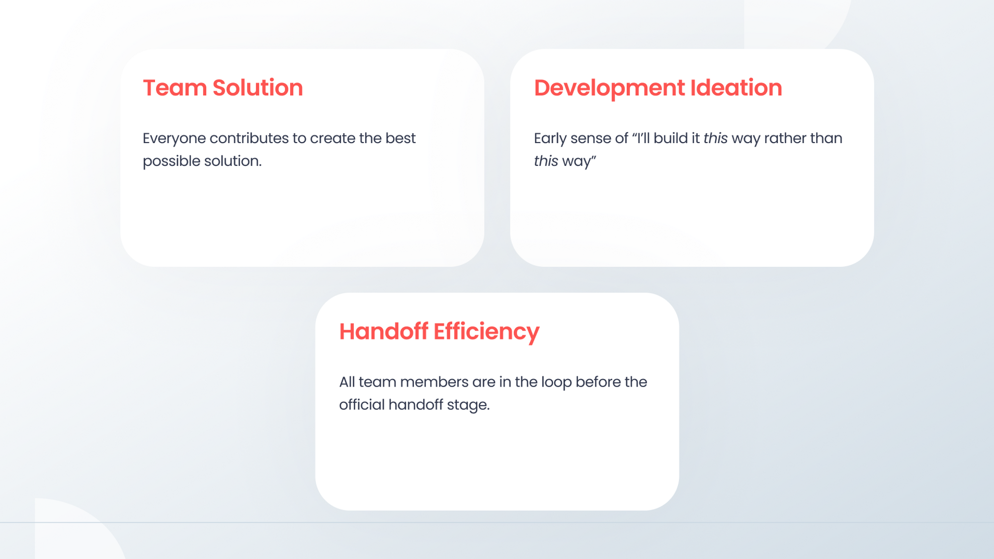
1. Everyone on the team contributes to creating the best possible solution.
Team solution is the first benefit to everyone being on the same page in ProtoPie from an early stage.
“The whole team should be in ProtoPie and understand where the files are, understand where the prototypes are, and be able to click through them themselves at all times,” says Taiki. “It makes the momentum and chemistry of the team even stronger, and at the end of the day, what the team is trying to do is collectively create the best product possible within the ideas of each individual.”
2. You can get an early sense of how to build the best product.
“Arguably, the most important one might be development ideation,” says Taiki.
He adds, “There’s a million ways to solve one problem in ProtoPie, but often, there is one best way to go about things for your team. Being able to think about that from a very early stage for everyone involved, including designers, the PM, the QA, the data analyst, and so on, it becomes a seed planted early on that helps throughout the whole process.”
3. All team members are in the loop before the official handoff stage.
“The third is handoff efficiency,” Taiki says. “When I hand off my designs to a developer, it's not just about dictating what I decided, but it's about agreeing upon an idea that we collectively decided upon.”
Maintaining seamless communication between all members of the team is an invaluable part of creating something new and innovative.
For the design team at Fetch, this became clearer than ever when redesigning the Snap Experience. In the next section, we’ll hear about their successes and setbacks for this particular project.
What you can learn from the Fetch Snap experience
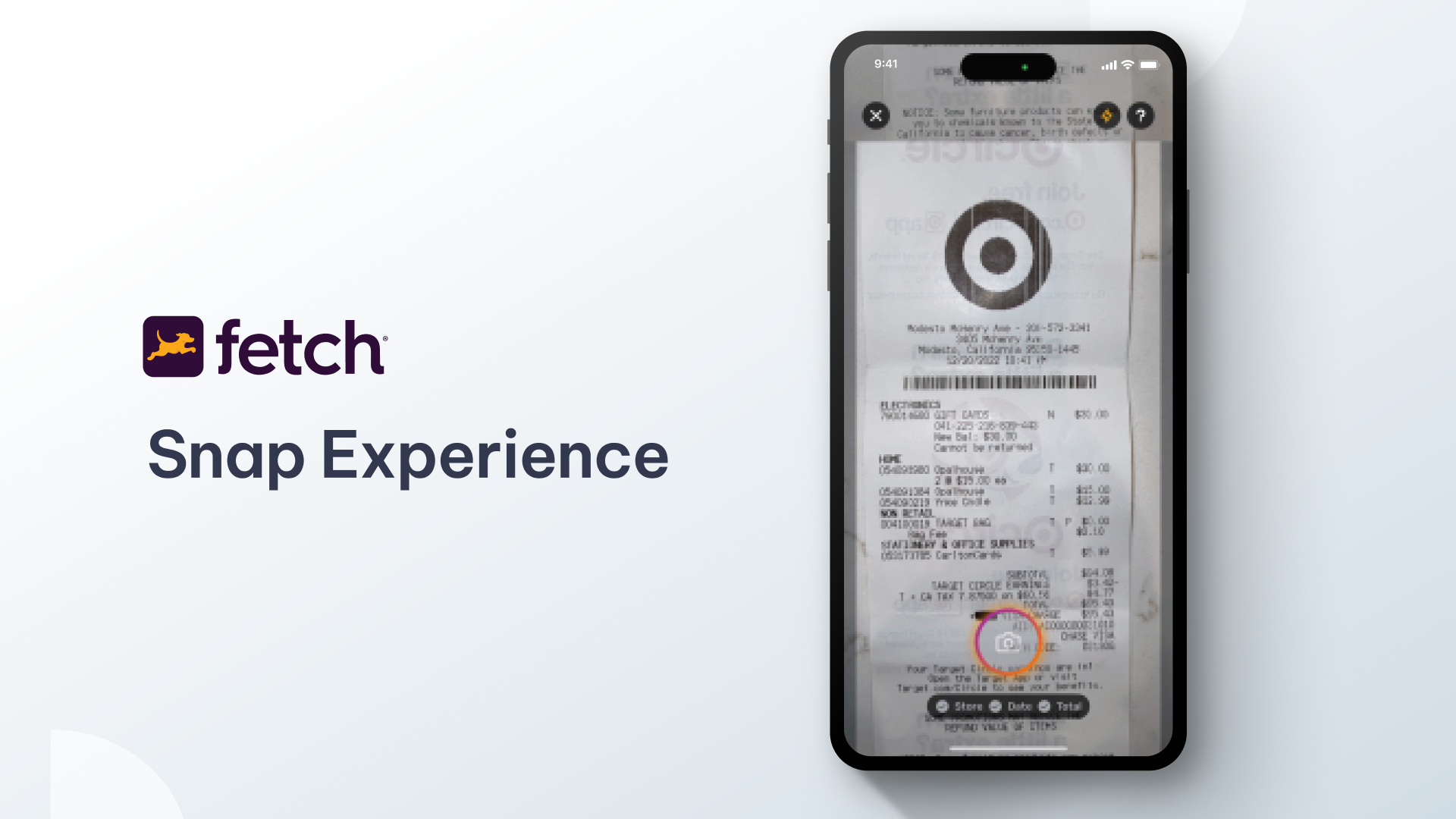
The Fetch Snap experience, a core feature within Fetch, allows users to take a photo of their receipt using the app's camera. The app recognizes the items on the receipt and rewards users with the right amount of points.
While nothing was necessarily wrong with the previous UX, the team wanted to create a new experience to elicit the excitement of their new Scan and Match technology that they had recently brought in-house.
Since the goal in itself was very vague, one of the first things they did was establish what they knew
Knowing that core experiences are fragile and that this would be an innovative project, the stakes were even higher. Users are hesitant to change, so it was even more important to make sure they knew what to do at each step.
As they weren’t fixing something broken, the Fetch designers also needed to have a conversation about where they could make the most impact and what metrics to use to measure success.
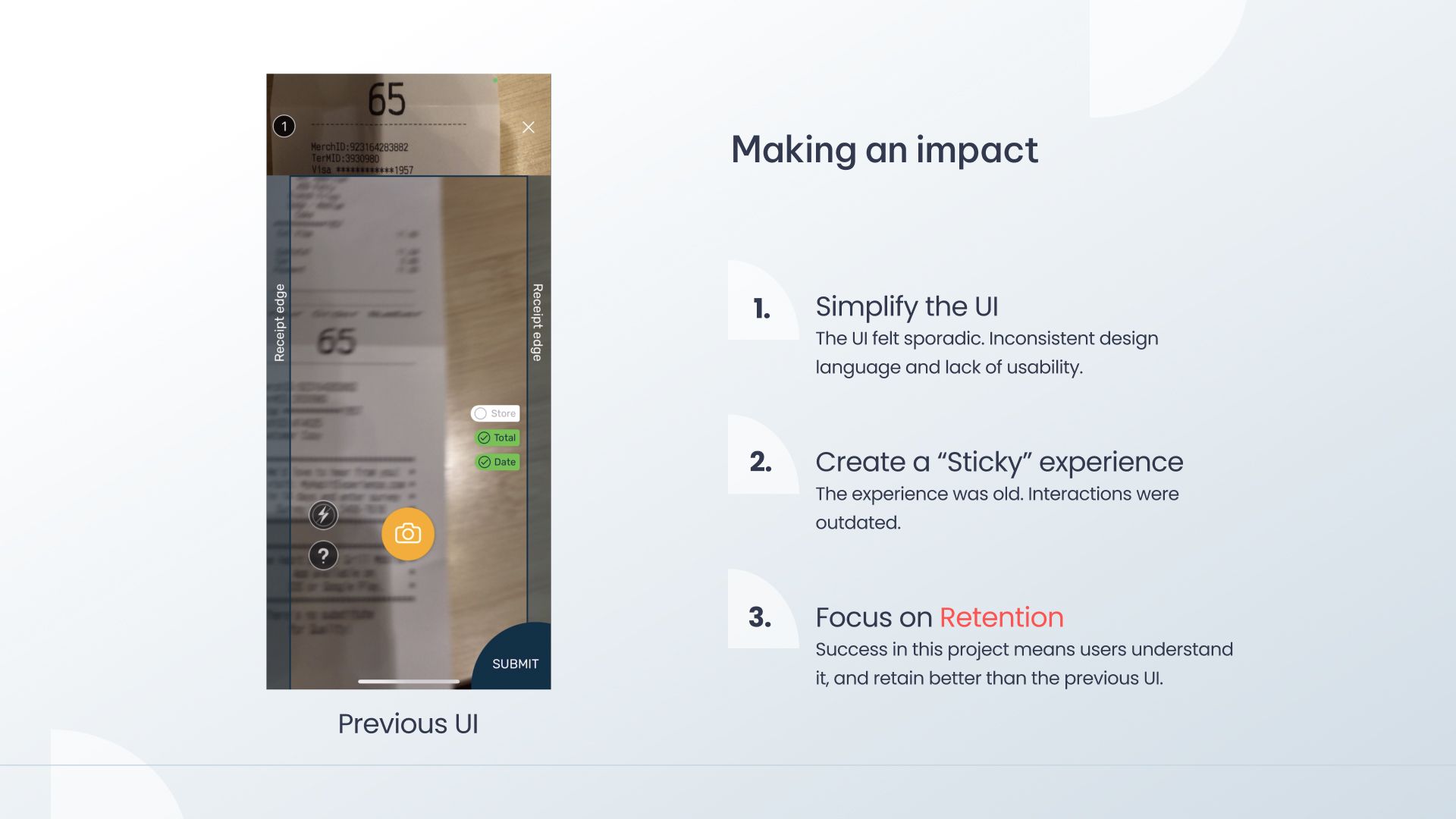
They found out they needed to:
- Simplify the UI: The previous UI design felt sporadic, inconsistent, and lacking in usability.
- Create a “sticky” experience: The experience was old, and interactions were outdated.
- Focus on retention: Success in the project would mean higher understanding and retention on part of the users compared to the previous UI. This metric was also aligned with company goals.
Taiki tells us that his memories of playing the Japanese game Kingyo-sukui as a child served as the initial inspiration for the new Fetch Snap experience. In the game, scooping as many goldfish as possible into a bowl requires a level of finesse and touch in motion, creating an addictive and memorable experience that compels players to return again and again.
“That was something that I was able to leverage in the story that I was able to tell about creating this new experience and, and how this would translate into users wanting to come back and get passionate,” says Taiki. “Like I said, storytelling becomes a big part of this.”
Goldfish scooping served as the inspiration for their initial concept. However, after having released the prototype to a few users, Taiki tells us that “what ended up happening was that no one understood it.”
“This is one of those moments that humbles you as a designer,” he adds, as he went on to summarize his key learnings from this experience.
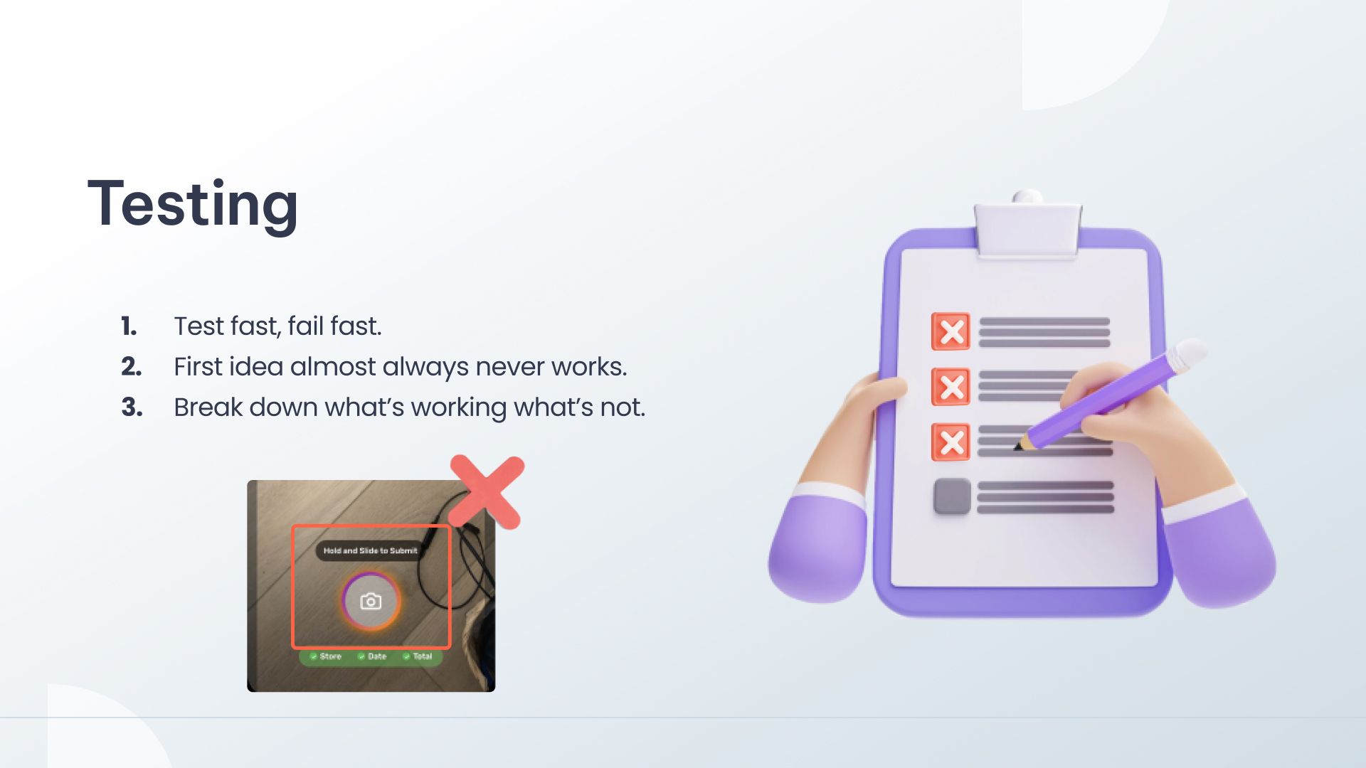
1. Test fast and fail fast.
“Being able to test part of this early was so helpful,” Taiki says. “Some of the learnings through this experience is that you test fast and fail fast. Because the team was able to collectively come together with a prototype early, we were able to find out that the [first] iteration is not going to work.”
2. Your first idea almost never works.
“The first idea and probably your most confident one just to begin with, might not always work,” says Taiki. “But just keep going, iterate off of it, and learn from what’s not working.”
3. Break down what’s working and what’s not.
“What we figured out was that users were so hyper-focused on the camera side of things that they didn't see anything pop up on screen,” says Taiki. “They were just waiting for the button in the bottom right that you saw earlier to pop up, which it never did.”
The final product and measurable results of the Fetch Snap Experience
The Fetch designers found themselves going back to the lab to figure out a solution.
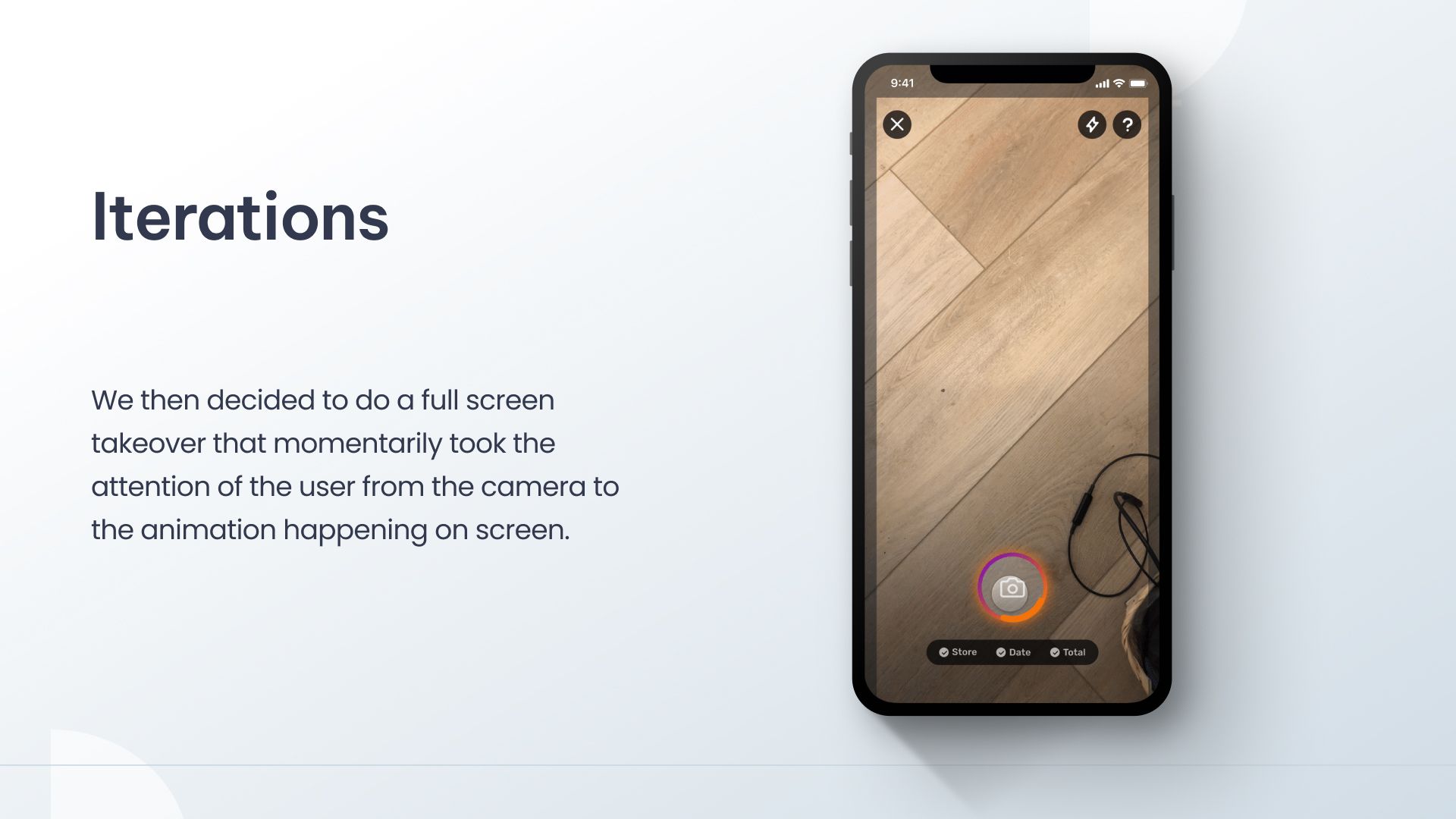
“We came up with this solution to momentarily grab the attention of the user by placing an overlay over the screen,” Taiki explains.
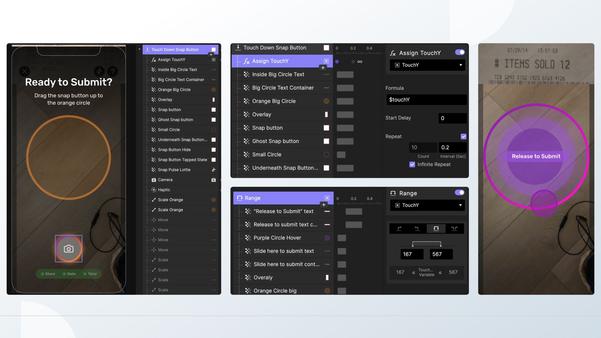
In order to do that, they had to add additional logic and UX copy, making sure that it was prompted at the right time when the user was ready to submit. They also added an animation at the button which displays what steps the user had to take to finish the action, complete with a touchdown trigger to understand where the user’s finger was located at all times.
“ProtoPie has a depth of prototyping that you can't get with other tools such as Figma, and this preset formula was one of them,” says Taiki. “I had a ton of fun creating this, and I hope to be able to use more of the formulas going forward.”
After the release of the new experience, the team was able to measure:
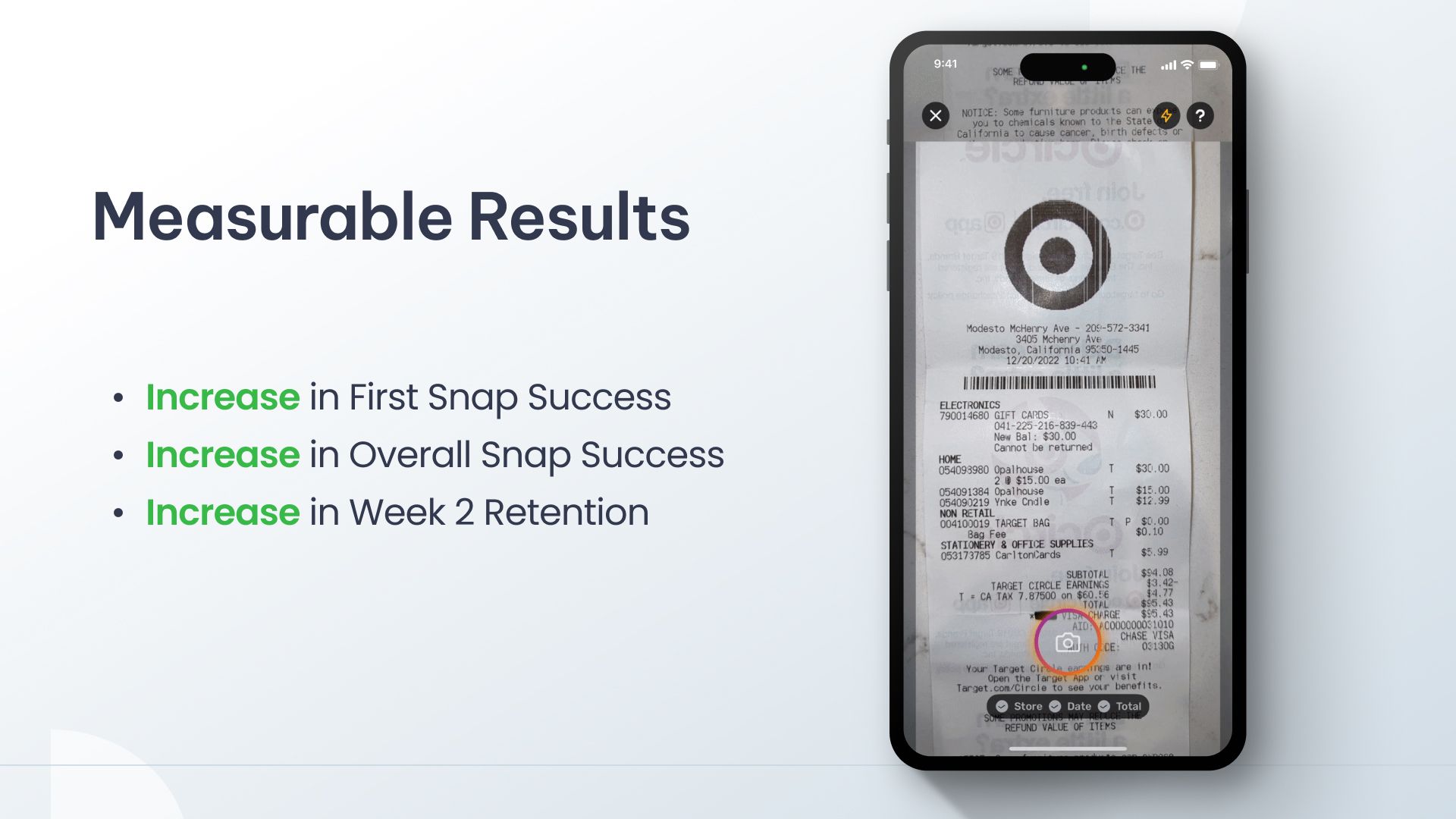
- An increase in first Snap success, meaning that users were able to complete the action at a higher rate compared to the previous UI.
- An increase in overall Snap success, showing that users adapted to the new feature experience well even after the first receipt snap.
- Increase in week 2 retention.
As his final comment, Taiki adds, “It’s been an amazing ride so far. There were definitely setbacks and some tough moments and long hours, but it was one of the most fun projects and I'm grateful for my team.”
Start prototyping at high fidelity for free
ProtoPie is the high-fidelity prototyping tool of choice for Fetch and more than 15.000 other companies. Get started on your prototyping journey today by trying ProtoPie for free!
