A Designer's Perspective on Prototyping—Going Beyond Artboards Being Snapshots
Meet Simone Menegaldo and discover his take on design workflows, prototyping, and why his team adopted the phrase "Just ProtoPie it!"

Recently, we met with Simone Menegaldo—a young Italian product designer who became one of the winners of the Pie Day Playoff.
Last March, Menegaldo stood out in the competition with his submission of a complete movie app prototype.

We sat down and chatted about his current job at a fintech company, the challenges of creating a product, and how he came up with the Movie App prototype idea.
Let’s deep-dive into Simone’s journey so far.
Hi Simone! Tell us a bit about your current work.
Simone: Hello! It’s such a pleasure having this interview to share my experiences. I currently work as a product designer in a fintech company called Kinesis Money. It’s a really exciting company—we’ve digitized physical gold and silver into a spendable cryptocurrency. Basically, you can now pay for your coffee in gold and silver with a debit card.
What are the workflow differences working as both a product designer and visual designer?
Simone: Visual and product designers are both tackling the same types of digital products. These are mainly native and web mobile apps, native and web desktop software, and responsive websites.
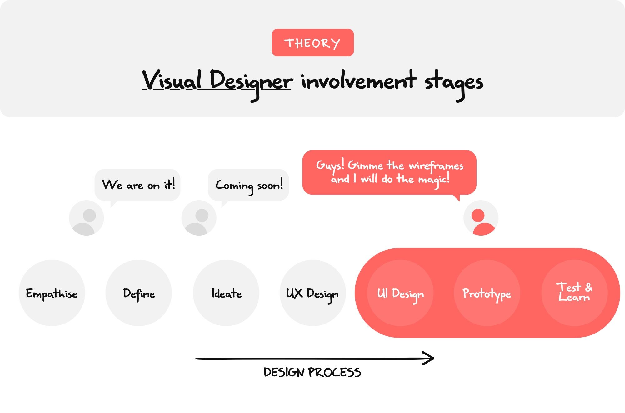
A visual designer’s workflow is really similar to the one of a UI designer. It starts from the wireframes provided by the UX team and stops after handing off all the designs, imagery, iconography, and animations to developers. Visual designers are responsible for having a holistic view of the aesthetic aspect of the product across various digital platforms, ensuring consistency in the brand identity.
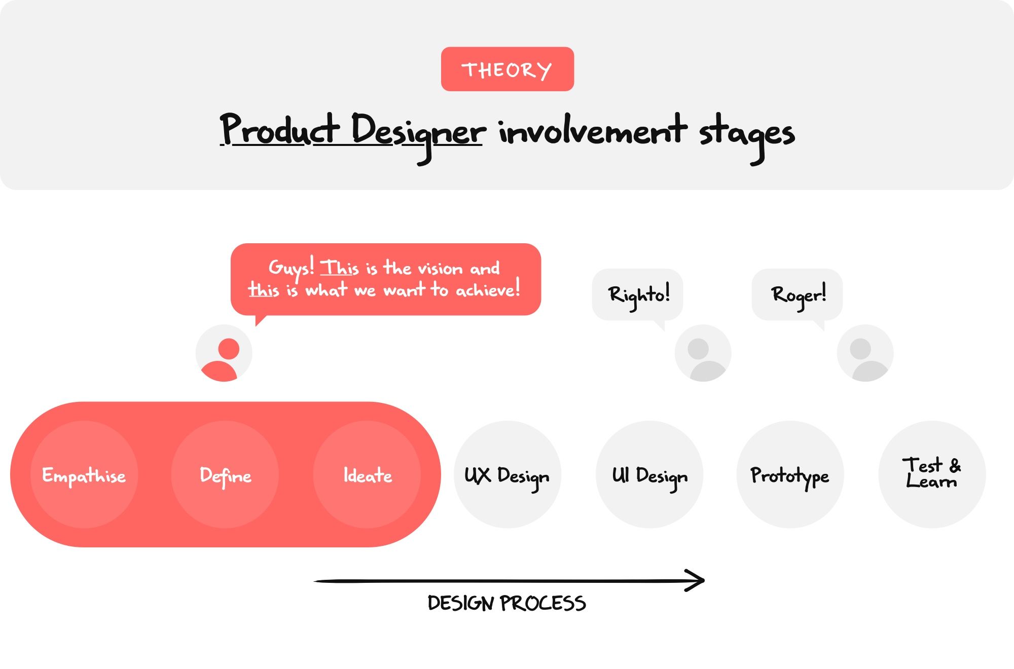
A product designer’s workflow is more comprehensive and can be considered an end-to-end, multidisciplinary design role. They start from the very beginning of the process when strategy, ideas, and vision are taking place. They bridge across other departments such as marketing and development, helping to define project deadlines, feature prioritization, feature releases, testing sessions, and so on. They work closely with UX/UI and visual designers, and they often cover these roles themselves.
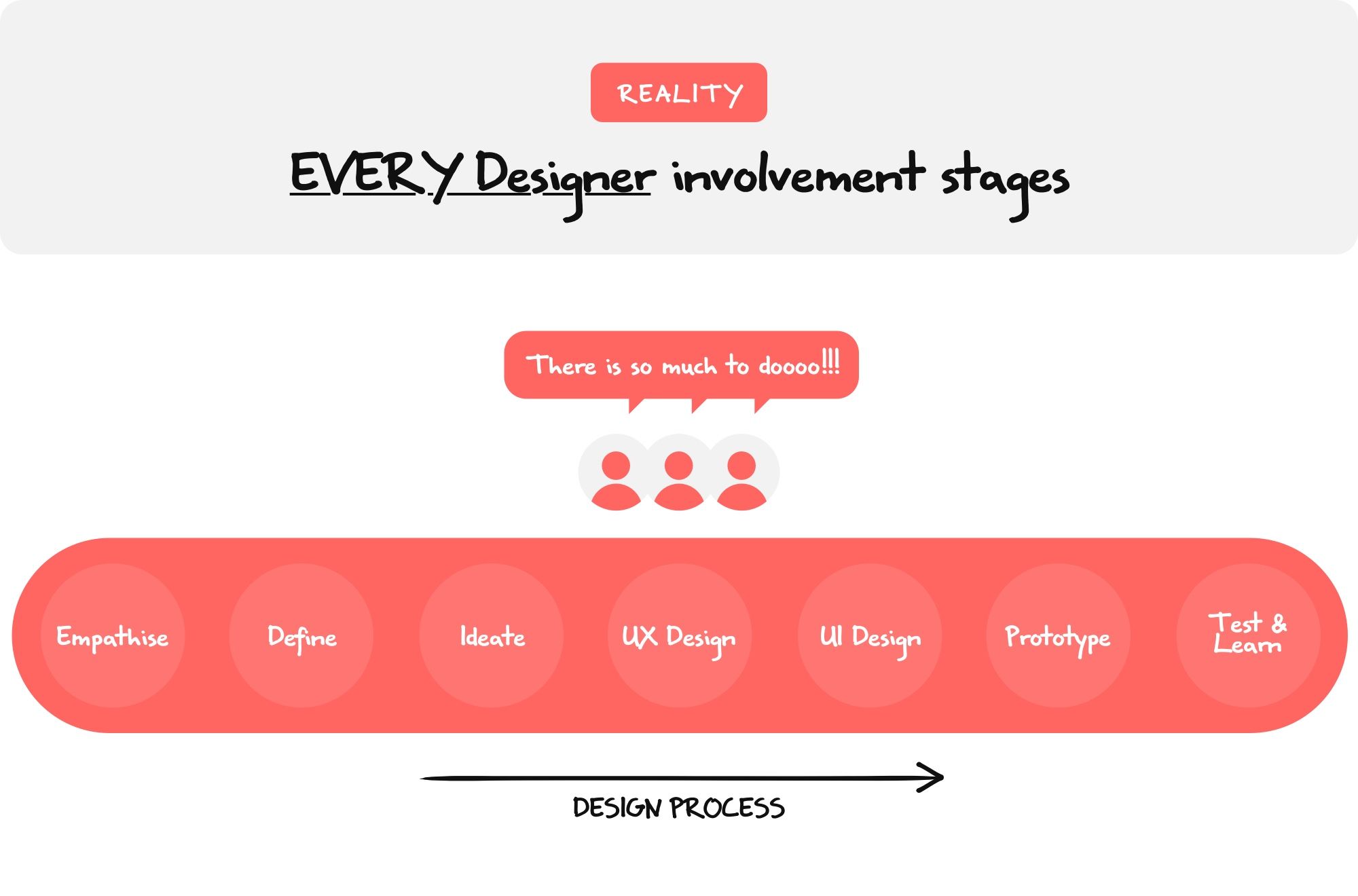
Although the responsibilities of product, UX, UI, visual, and graphic designers are theoretically well defined, the line between them is quite blurry when applied to a real working environment. This is a result of them working really closely, everyone gains experience and knowledge about the different phases of the design process, and in turn, makes contributions between different design roles happen naturally.
Why did you decide to take these two design roles?
Simone: After graduating in industrial and graphic design in Venice I moved to London and started my career as a visual designer. Over the years, I noticed how there was a strict correlation between the industrial design knowledge that I learned at university and the product & UX design processes. I naturally started to stretch my responsibilities as a designer, covering products in a more end-to-end approach. Consequently, I identified myself more as a product designer where I’m able to use my ideation and problem-solving skills along with aesthetic aspects of the product.
Which of your works are you the proudest of and why?
Simone: These are two projects that I’m proud of.
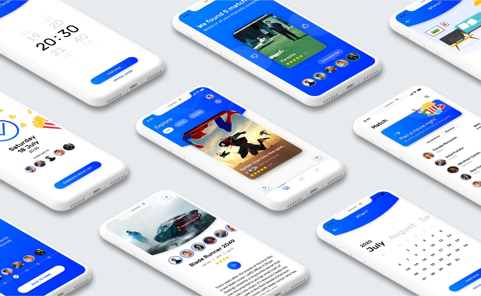
I’m really happy about the outcome of Movie App—Discover movies and plan the perfect movie night. This side project kicked off with a bunch of friends and because I was the only designer of the group I had the opportunity to define all the different design aspects of the product. Covering ideation, product features, UX, UI, and “ProtoPie-sation”, this project is the one that showcases my thinking and skills the most.
I’m also really happy with my contribution to the Kinesis Money desktop platform. Although the product was already at the late stages of design & development when I joined Kinesis Money, I contributed to enriching it by designing new sections and assets. Being able to select the most relevant content for our users, visually balancing the design of a page, finding the perfect timing for a JSON looped animation are all tasks that I find really gratifying. I feel proud to be part of the Kinesis Money design team.

What role does prototyping play in a desktop web platform related to cryptocurrency such as Kinesis Money?
Simone: I think prototyping plays a similar role in all industries, whether you are designing a cryptocurrency trading platform or a shopping list app.
Everything you design in Sketch or Figma is pretty much static, your artboards are just snapshots of the final product. Prototyping adds in the "time" factor, allowing us to test if a transition is too fast or too slow if an interaction feels right or not, if an animation helps to clarify the content or if it just adds confusion. The prototypes we create are not only useful for testing purposes, but they are also the best way to communicate to our developers how the product should work, which consequently speeds up the handoff process considerably between design and development teams.
What are the most challenging parts in prototyping a product, from a technical perspective as well as a UX perspective?
Simone: Being able to maintain that sense of team contribution and collaboration that we used to have before the beginning of the pandemic is to me today’s biggest challenge when prototyping a product from both technical and UX perspectives.
The way we work has drastically changed since the beginning of 2020. We all had to shift to working fully remote and face all the challenges that came with it. After some months of working remotely, I have to say that I’m surprised about how effective it turned out to be, to the point where I wouldn’t go back to working full-time in an office. Although there is plenty of software that allows real-time collaboration to make you feel as though you are working next to your colleagues, there is a specific phase of the design process that doesn’t yet work as smoothly as in real life...
...I’m talking about the initial UX phase, the one that involves the classic, old school, and evergreen marker on the whiteboard. The wireframes that we draw and the jungle of arrows that connect them are the foundation of the UX and the most primitive form of a prototype.
The energy and the empathy that sparks amongst the team while wireframing together on a whiteboard are still something that collaborative tools haven't been able to reproduce yet in my opinion. Holding a marker in front of a big whiteboard brings back that creativity and sense of freedom that we used to have when we were kids but somehow lost over the years. The speed at which you can doodle your UX solutions, from the most complicated to the silliest, does not compare with what any digital device offers today.
Did you have deep knowledge about cryptocurrency before starting your current job? If so, please elaborate.
Simone: No I didn’t, but now I’m into it! Before starting this job my knowledge about cryptocurrencies was limited to hearing those stories of people losing hard drives full of Bitcoins that today would be worth millions of dollars. I had no idea how to buy, sell, send and receive cryptocurrencies and suddenly I got catapulted into the position of having the responsibility of designing platforms capable of doing that. During my first months at Kinesis Money, I conducted a lot of research, deepening my knowledge about trading and understanding what each of the main currencies is capable of.
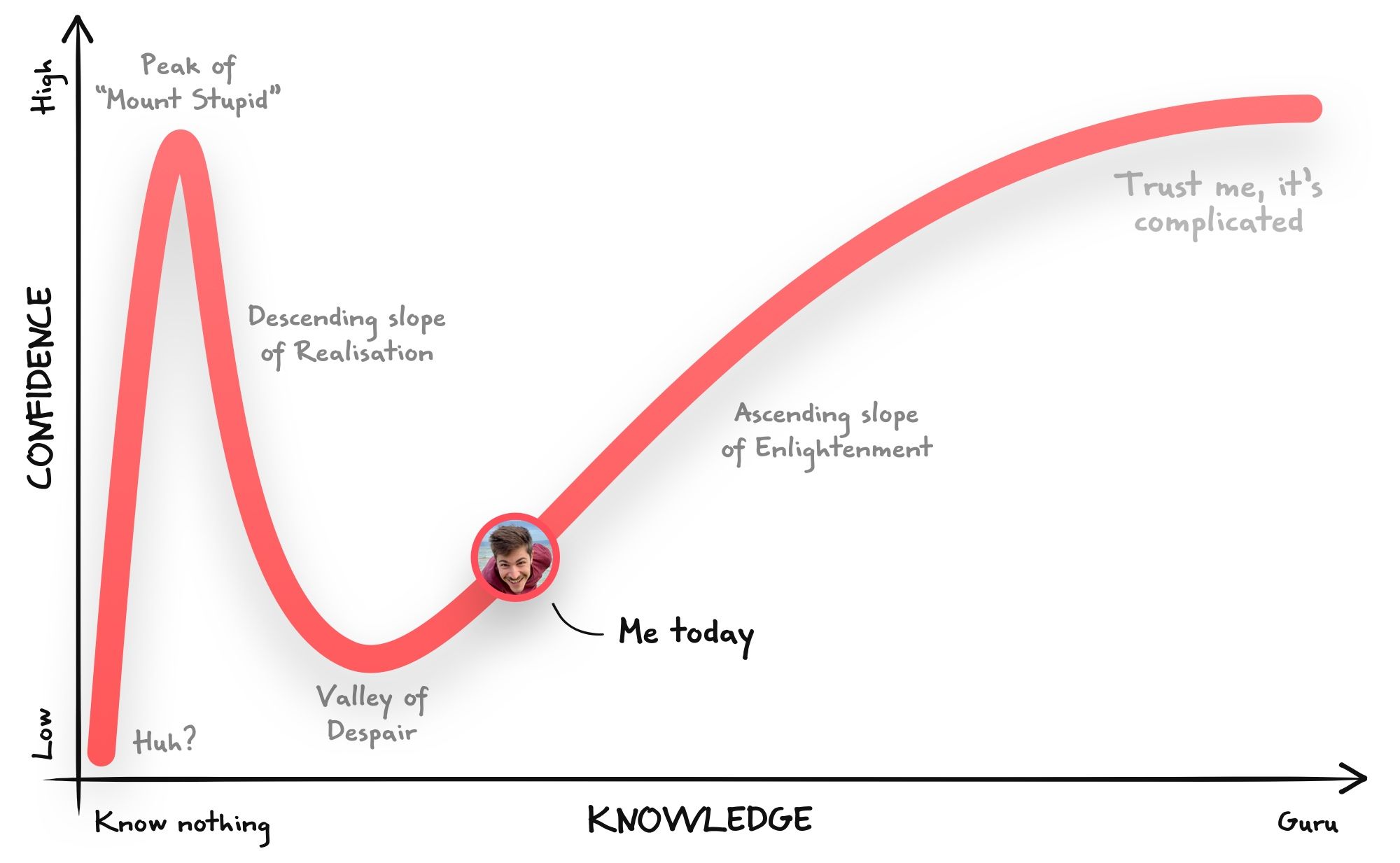
I think I’ve experienced the Dunning-Kruger effect. In the beginning, everything seems to make sense, you learn a lot in a short span of time and you think you have a good understanding of the subject. Then, the deeper you learn and the more you realize how complicated it can be and how little you actually know! Luckily at Kinesis, I am surrounded by experts in this subject which helped and still helps me every day to learn more and more about this fascinating world.
How is ProtoPie involved in your workflow?
Simone: We often come up with really creative solutions and interactions for our web platform and for our website (which we are redesigning top to bottom these days, stay tuned!). There are times when pitching an idea to the team with just a few sketches is not enough to explain what you are picturing in your mind. That’s when we say: “Just ProtoPie it!”. We all like ProtoPie as its simplicity allows us to create quick prototypes in minutes. It helps us to quickly comprehend if a certain idea is not as good as it was in our mind, or if we just came up with a really awesome solution! And all this, without any coding!
How did you come up with the idea of the Movie App prototype and what was the process to bring it to life?
Simone: It started in 2017, I was in a Japanese restaurant having sushi with 8 friends and one of them said “Guys, I have an idea!”. The 9 of us have different backgrounds including design, marketing, software engineering, and data science. So we decided to give it a try and we formed our team, the “Strike 9”! We occasionally met to work together, but unfortunately, we realized that our dream was too ambitious for a side project and our MVP was still too complicated and time-consuming to develop end-to-end. We sadly stopped working on it and parked our idea.
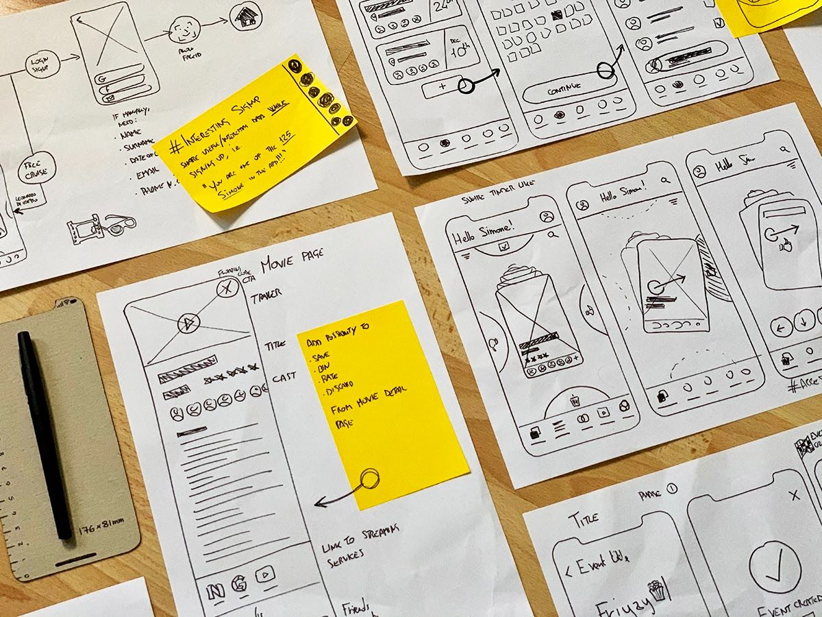
A couple of years later, I started using ProtoPie and I discovered how interactive a mobile prototype can be. That’s when I decided to go through my old sketches of the movie app and bring it back to life! I spent five weeks refining the core user experience, polishing the visual identity, and making the prototype. It was a fun way of learning ProtoPie and I was really happy to see how in one way or another, I was always able to prototype every single interaction that came up in my mind.
I showed the prototype to my friends and it was able to light up our original excitement about this project, to the point where we are considering giving it a second chance and trying again to transform the original idea into a final product that everyone can have on their phones!
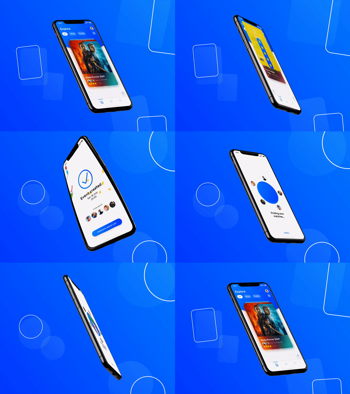
You can try Simone's Movie App prototype by yourself.
What advice would you give to someone who is new to ProtoPie?
Simone: I would recommend never giving up on trying to prototype your ideas. We all have creative solutions to our design challenges and sometimes they can be hard to prototype and to make them work in the exact same way as we imagined. Well, I can assure you that by using the wide set of tools that ProtoPie offers, you are in the right place to craft the best prototype you have ever made!
...
Want to start making prototypes like Simone does? Create any interactions you imagine with ProtoPie.
.png)