A Guide to Creating Reusable Components in ProtoPie - Part 2
Learn how to create a powerful, scalable radio button component from a single element, reducing code and improving your prototyping workflow.

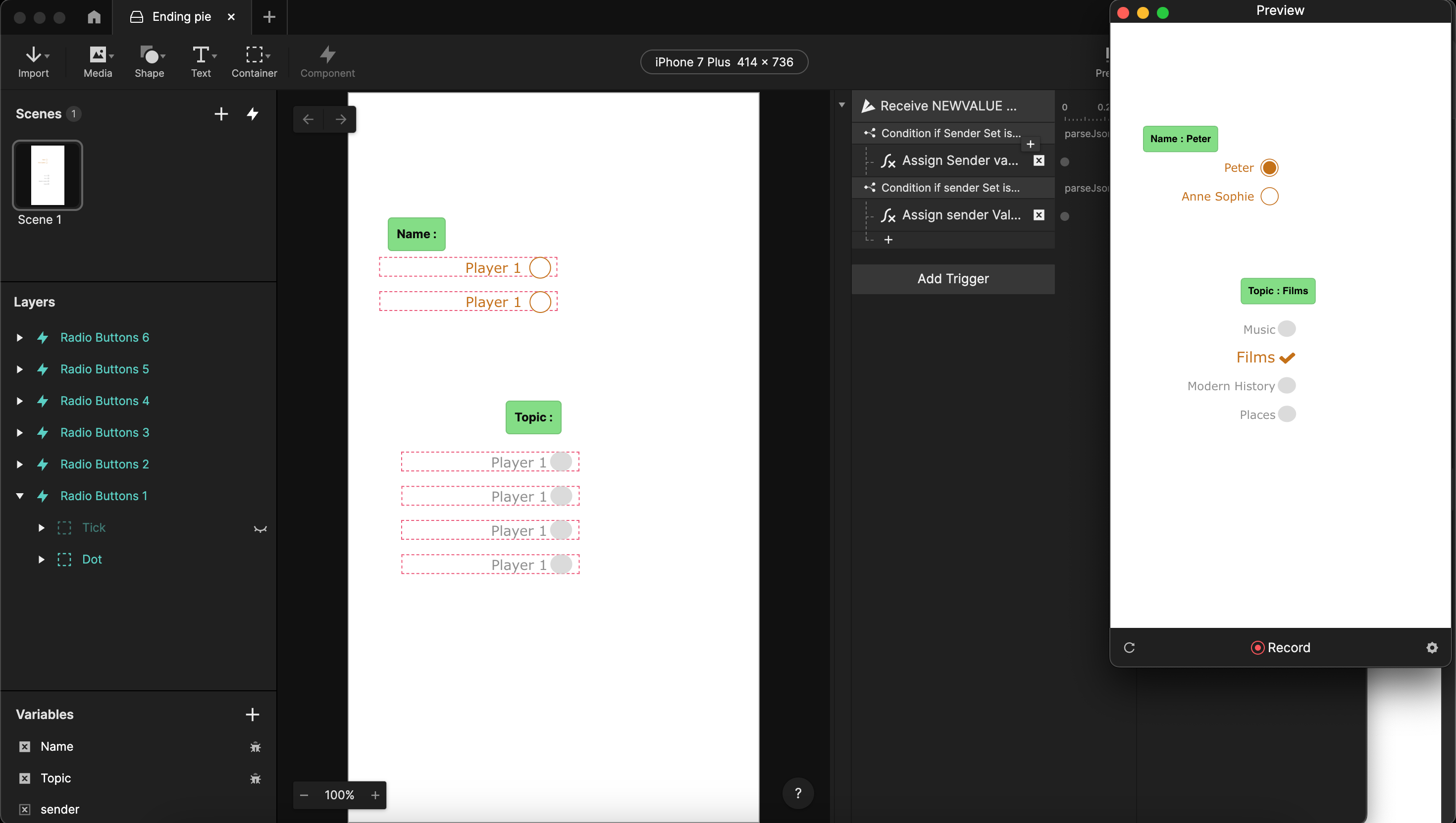
In Part 1, we built a reusable radio button component. While useful, it still required a lot of code, was prone to errors with small changes, and was limited to a maximum of six buttons.
This time, we'll level up our approach. We will create a highly efficient component from a single radio button that can be used to build a set of any size. This method dramatically reduces the amount of code and makes your components more powerful and flexible.
Before we jump into the tutorial, it’s important to understand a few essential concepts to follow along:
1. JSON Structures
ProtoPie messages can only send one value at a time. We'll use JSON to bundle multiple values into a single message, allowing us to send more complex information.
2. Overridable Variables
Think of these as custom properties for a component instance. They allow us to give each radio button a unique identity and function, making our single component truly reusable.
3. Overrides in ProtoPie and Figma
To maintain sync between Figma and ProtoPie, you must be careful about what you override. An override in ProtoPie will always overrule a change from Figma. As a general rule, avoid changing graphical properties (shape, color, borders, fonts, positioning) in ProtoPie. It's better to manage these in Figma or change them in ProtoPie using responses to a 'Start' trigger. While text values and opacity can be changed in ProtoPie, it's still often better to do so via a trigger.
4. Opacity vs. Hidden Layers
ProtoPie doesn't have a response to "hide" a layer, but you can change its opacity. Critically, there's no way to check if a layer is hidden, only a way to access its opacity. Remember that a layer can be hidden in the layer panel (and thus invisible) even if its opacity is 100. You can delete or hide layers from a Figma import without breaking the sync, but this must be done in ProtoPie Studio, not through interactions.
Ready to build a smarter, more scalable component? Let's dive in.
Building a single, general-purpose radio button
Pre-requisites
To follow the tutorial, you can download the starting pie & Figma file here: Starting pie | Figma file
The ending pie is also available for download here: Ending pie
Step 1: Initial Setup
Open the “Starting Pie.pie” file. In case you don’t have access to Figma, skip right to Step 3.
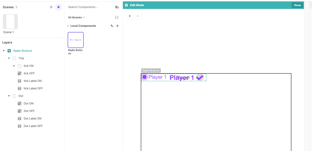
Step 2: Import & Prepare Figma Assets (Only possible with access to Figma)
Delete the local component that’s present in the “Starting Pie.pie” file and import the “tutorial.fig” file into Figma. You should see two radio button designs: one called 'Tick' and one called 'Dot'. Select both and open the ProtoPie Figma Plugin. Export both objects to ProtoPie (make sure the plugin shows it’s exporting 2 objects).
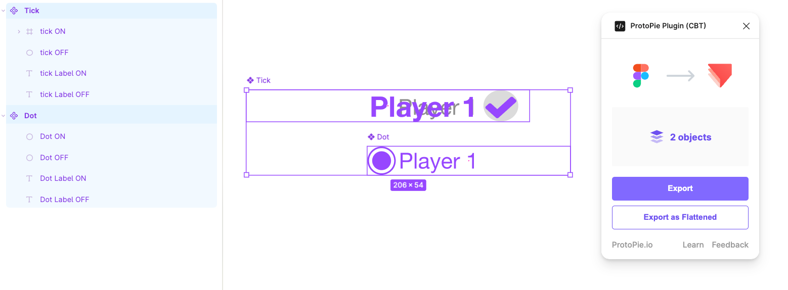
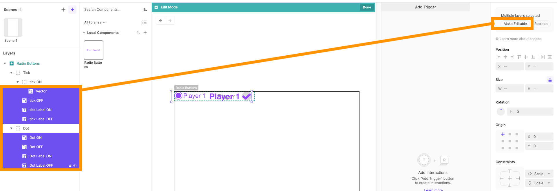
Back in ProtoPie, set the position of Tick and Dot to 0,0 and rename the component to “Radio Buttons”. Open up the layers in Tick and Dot and make sure that they are all editable (click “Make Editable” if they are not). At this point, it’s also a good idea to set the opacity of the ON layers to 0, so that only the unselected buttons are visible.
Step 3: Create Component Variables
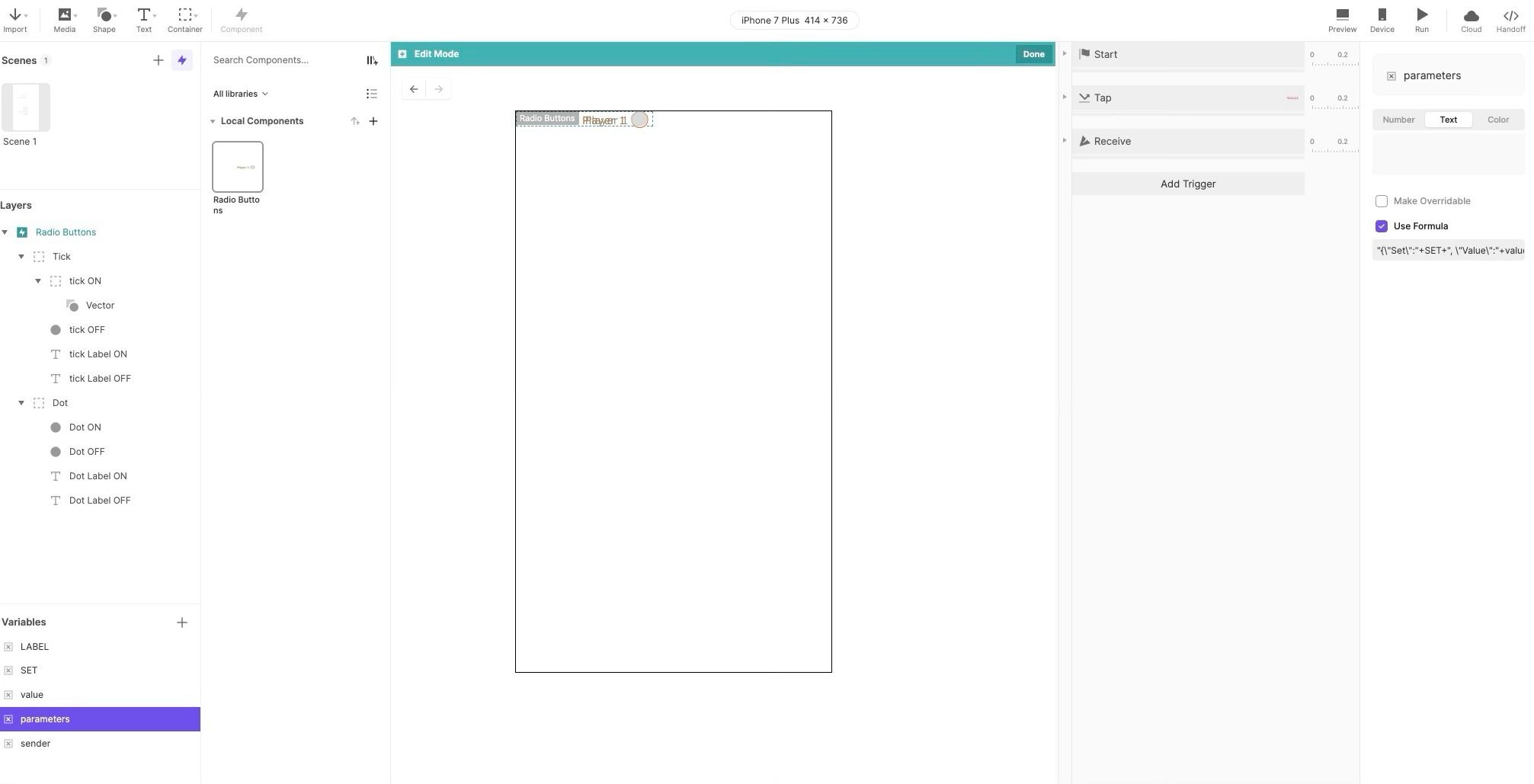
Open the component editor for the Radio Buttons component. We’re now going to create the necessary variables:
- Add an overridable text variable called ‘LABEL’ - we use all capital letters to represent overridable variables.
- Add another overridable text variable called ‘SET’.
- Add a text variable called ‘value’ - no capital letters for formula-defined variables - and put in the formula regexreplace(LABEL," “,""). This enables your radio buttons to have spaces in their UI representation, but an internal value without spaces (this would mess with using JSON).
- Add a text variable called ‘parameters’, defined by the formula “{\”Set\":"+Set+", \"Value\":"+Value + “}”.
- Lastly, add a text variable called ‘sender’. This will be used to receive the value when a message is sent.
Step 4: Populate Labels on Start
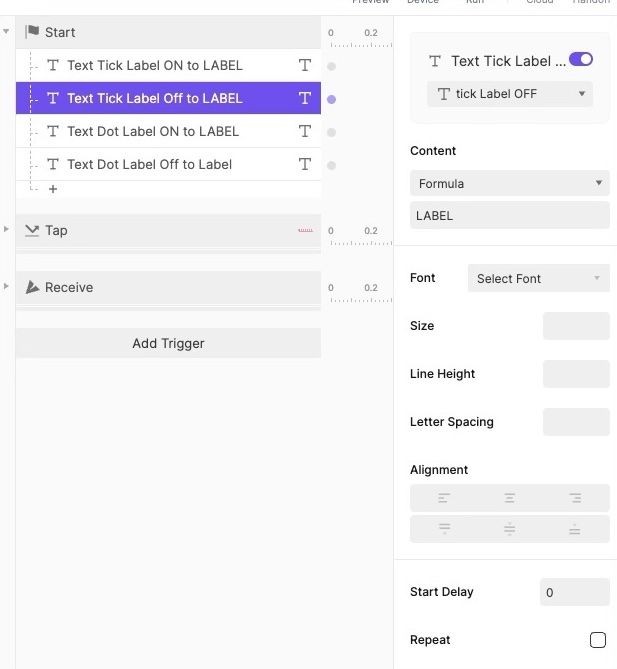
Now you can add the code to the component. First, you need a ‘Start’ trigger to fill out the various potential text fields with the appropriate labels. For each text field in your component that should show the button’s label, add a text response to put the variable ‘LABEL’ in the field.
Step 5: Create the 'Tap' Trigger
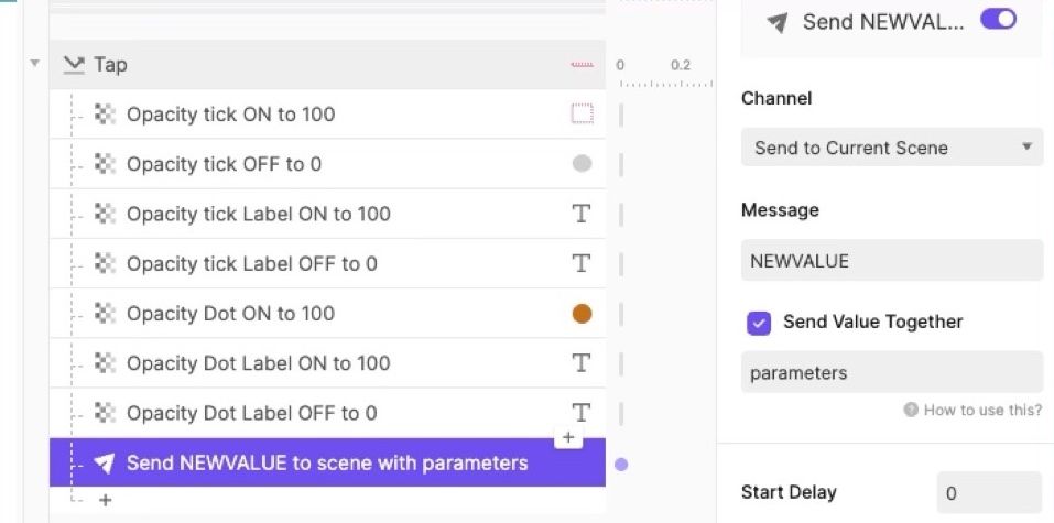
The main code required is a response to a ‘Tap’ trigger; when the component is tapped, turn the button on using the necessary action. At its most basic level, this could involve setting the opacity of any ‘ON’ layer to 100 and the opacity of the ‘OFF’ layers to 0.
Aside from turning the button on, you also need to send a message to the whole scene to indicate that a ‘NEWVALUE’ has been chosen, which is passed with the variable parameters as its value.
Step 6: Handle Incoming Values
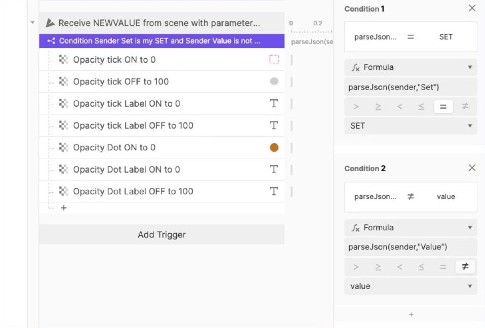
The component needs to receive a ‘NEWVALUE’ message. If another button instance is selected, then this instance needs to turn itself off. To do so, add a ‘receive’ trigger for ‘NEWVALUE’ and assign the attached value to the variable sender. Now we can use the parseJson function to check if the sender is in the same set, but has a different value, in which case we turn it off (reverse the ‘ON’ actions from the ‘Tap’ trigger).
Step 7: Assign Values in the Scene
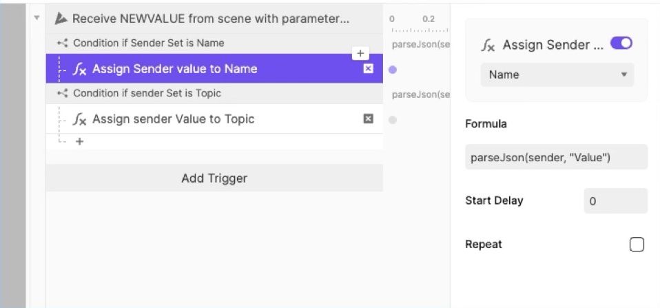
You can now switch back to the scene to use the new component. You need to create a ‘receive’ trigger for the ‘NEWVALUE’ message in the scene, which will also assign the attached parameters to a variable called ‘sender’. Then, for each of the possible sets, you check if the sender is in that set, in which case you store the value in the appropriate variable. This code will need to be manually updated for each radio button set you want to create.
Step 8: Build the Button Sets
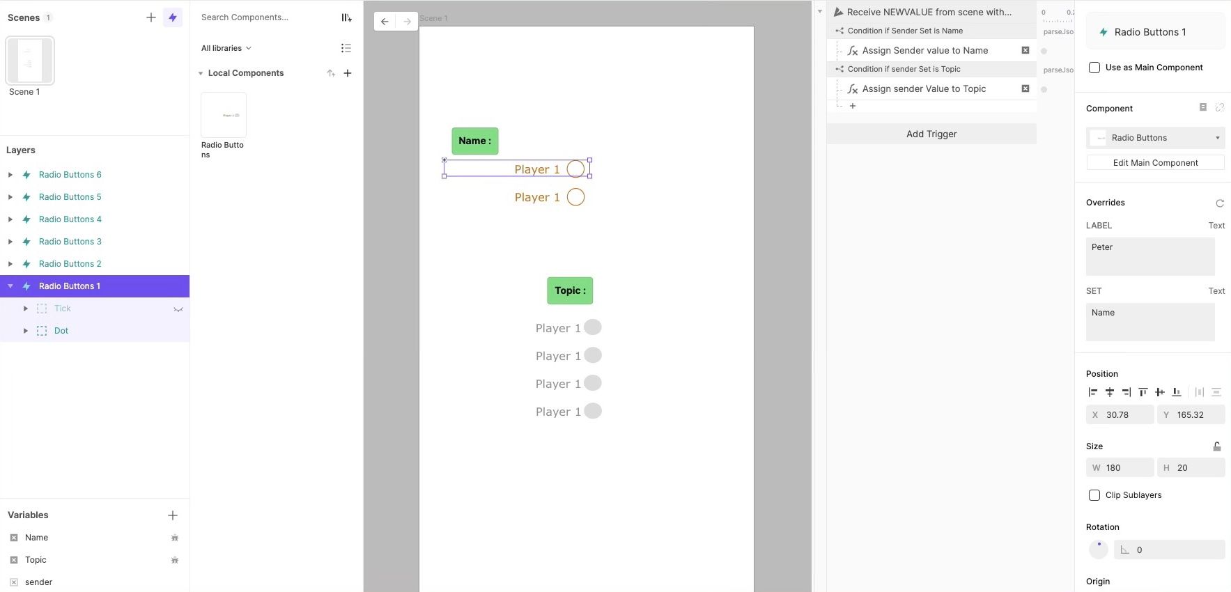
To use the pie, drag repeated instances of the component into the scene and give each its own LABEL and a SET to belong to. You also have to create a variable to store the current value for that set. A set can contain as many buttons as you want, but each button must have a different LABEL and the same SET.
Each radio button will still show both the Tick and Dot variants, so within each SET you also need to hide all the Tick or Dot versions.
Step 9: Sync Design Changes
Now you can return to Figma to refine the visual design of your radio buttons, adjusting colors, fonts, spacing, or alignment. When you're ready, simply re-import the updated frame into your ProtoPie component.
As long as you haven't directly modified those properties in ProtoPie, they will automatically update to match your Figma design. Your interactions should continue to work perfectly.
What if a style doesn't update? If you accidentally changed a property in ProtoPie (e.g., the color of the "Tick" or "Dot"), it will no longer sync with Figma. To fix this, delete the modified layer within the component, re-import the clean object from Figma, and then relink the new layer in any responses that were using it.
Pro-Tip: To experiment with changes in ProtoPie without breaking the Figma link, apply them using a Start trigger. This code-based approach overrides Figma styles only when the prototype is running, keeping your component's structure clean.
Upcoming
The next tutorial will take the Figma story a step further and explain how to create reusable components from a Figma Design System in a ProtoPie Team Library. That way, it is possible for one team member to make changes in Figma, update the ProtoPie library, and then all pies built from that library will adjust to the new design system without any recoding.
This in-depth guide was created by David Gilmore, Director & Consultant of UX Design.
.jpg)
.jpg)